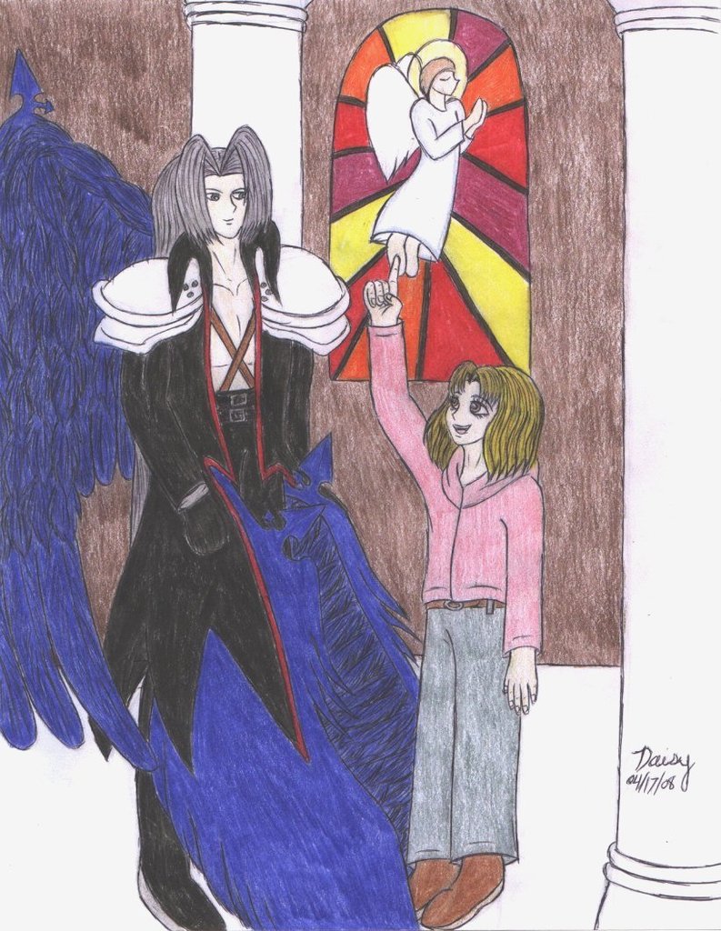
nodnod. Trying it manga-style might be fun sometime, just as an experiment. X3 Though somehow I'm still picturing this part as a full-page spread because of how significant it is.
I can't remember if the pillars were part of my original idea or not. I think they were, because of the images of the church in my mind. X3 I'm definitely happy with how they came out! The window, too.
I was really happy with Sun's expression; I think it came out right pretty quickly. And the tip-toe addition worked well, too, though I think that happened by accident. LOL.


Well...if you made a really, reeeeeeeeally tall picture with "smushed" window it could conceivably work, but that'd be way more negative space in a picture than would look decent, yeah. You probably could've done it in panels like a manga page, with a shot of the window and a shot of them, but I think this works best as an individual image.
I like the pillars especially...they give a sense of space, and help convey the idea that they're in a church (a stained glass window alone isn't enough, anymore...people are having them installed everywhere!) The colors on the window itself are very nice, too...they're nice bold, solid colors, and really brighten up the picture.
I also like Sun's expression...she's all full of child-like enthusiasm, and I like the little detail of her standing on her tip-toes to point to the window. ^_^