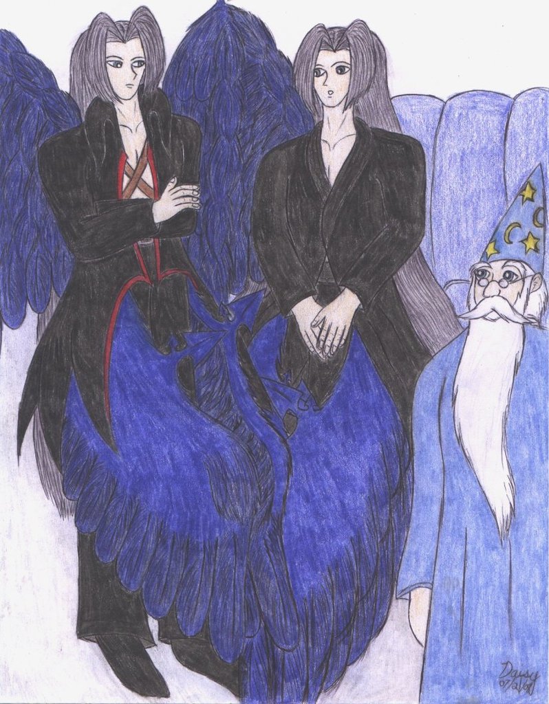
nodnod. The lower wings really came out amazing. X3 I love them here.
The eye placement really does look awful! XD; I never have tried those generic facial guidelines, if you mean the thing with drawing a circle/oval, making lines to indicate where eyes and whatnot should go, etc.... Well, I tried once or twice, but for me it made it harder because I wasn't used to it at all and I'd already been drawing for a long time without doing it. I might have to try it again, though.
Merlin was a lot of fun to draw. X3


I really like the lower wings on this one...all the wings are nice, but on the lower wings, the stretch of solid color brings out the detail in the individual feathers.
I like the contrasting attitudes presented by the two Sephiroth-shaped beings, particularly the hand-placement. The eyes look a little bit off, though...have you ever tried sketching in those generic facial guidelines while you plot out features? They were invaluable to me when I started drawing people.
Your Merlin makes me smile...he looks just the right combination of Disney and anime...and his facial hair looks so fluffy. XD