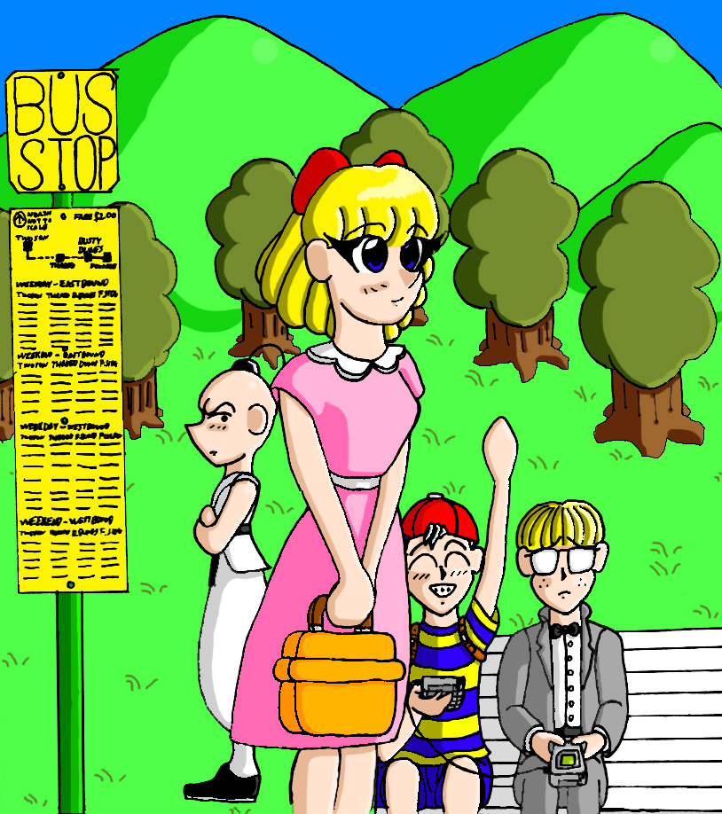
At LAAAAAAAAAAAAAAAST! It's DONE... >_< I can't even REMEMBER when I started this stupid picture... However, the lineart which this picture replaces on here, was uploaded in 2003, so that should give you an idea. I suppose I COULD look up the lineart file and see when it was made but... I'm too lazy... :p In anycase, this picture has been in limbo ever since our monitors started dying on us, leaving us with no way of CGing since we couldn't see what color we were using. I picked it up again after finishing Darrow's Melfina and I was making good time with it too--though... I've changed the way I color and shade since the last time I had worked on it so... Uh... I think I confused Photoshop because there was a lot of weird bleeding of colors that shouldn't have happened and the select tool just acted bizarre during the process... But nevertheless... It's done... Xp
This picture came from an idea to do a whole SERIES of pictures, each based on a location in Earthbound, however... ^^;;;;;;; I only ever produced this one image. Basically, the party waiting for the bus at Twoson. If you're familiar with my work, you can tell how old this picture is just by looking at how the kids are drawn... And the background... >_< It was never much to begin with and really... I rushed it off in one night because I REALLY wanted to get this thing finished for once and for all so it's not great. Anyway... it's done. So there. What's next? Probably some natural media stuff until I can get my hands on a copy of Photoshop 7.


Yaaaaaaaaaaay, this picture is finally done! I remember liking the lineart, but seeing it in full, glorious color makes it seem even better!
I imagine it must've been weird changing your coloring style in the middle of the picture, but I really can't see a difference between any parts of the picture--it all goes well together! Paula looks especially cute and cheery in her pink dress--her colors really stand out, making her the focus of the picture, along with the bus sign! BTW, I love how detailed the sign is, with the schedules written in and everything--great touch! Another touch I really like is the little shine on the GameBoy scree, but then again, I love shiny things in pictures... ;)
The background IS a little rushed, but it's suitable for the picture... I like the little grass strands--so fitting for Earthbound!
This is definitely getting me pumped to play tomorrow! And I think you should continue that series of pictures of the characters in the different towns!