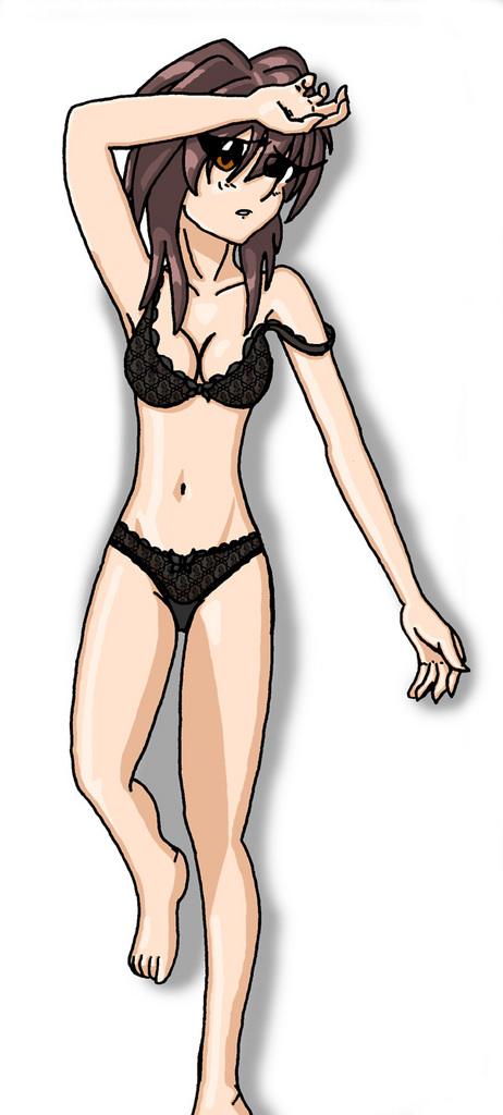
Very awesome, Red. I was already impressed with the detail on the lace in the enlarged versions, but seeing it complete is a nice surprise as well. The pose is very well done, but what I like the most is the coloring. The time and attention put into the shading is very well done. All in all, I'd say it's a sexy picture with a lot of good qualities. As for the eye....well, whatever, it's Melfina in lacey underwear. The eye is one of the last things to catch my attention. ;)

Another Melfina for Darrow by @migucast (Miguel Castaneda)
Well, now that the message board's gone, I suppose it's pointless mention this but... Anyone remember when I asked about black lace lingerie on the Help Board? Here's the result. Darrow wanted Melfina in black lacy underwear and that's what I did--or at least tried to do... I've never done that sort of thing before and it took FOREVER to figure out HOW I was going to do it or what kind of pattern I'd use. It's hard to see at this size but I'm used the symbol of the Lay Line for the pattern and slightly more noticable are the butterflies, which are part of her whole "thing"... Anyway... He enjoyed it to say the least.
Comments & Critiques (5)
Preferred comment/critique type for this content: Any Kind
This is a great piece, Red, really! I really love the hands and the underwear, not to mention the fact that the bra strap is sliding off...ahem
I think the skin shading, with the exception of the left leg with the really huge shadow, looks very professional - in fact, the whole thing does, except where the outline isn't quite as smooth as it might be. Looking at the picture as a whole (and at your work in general) the lines are very smooth, but sometimes there are a few kind of jagged edges...in this image I'm looking at her right outside thigh when I say that. I hope you can see what I mean. I guess you could try the pen tool or maybe blurring to touch that up, if you were so inclined. It's a very small and trivial thing anyway, but maybe worth pointing out.
I have to hand it to you for that pattern - it's really hard work doing those, and you really have to work on a large scale and it messes with your mind because it looks so weird up close, but so much better when you're "zoomed out"! All complicated patterns are like that, really.
Overall, very sexy and very well done. Great work! :)
Uh... I'm not really seeing what you're talking about... It all looks smooth to me--though, to be honest... The WHOLE thing is actually QUITE jagged! :p But you can't see it at this size. It has to do with how we scan pictures and then use brightness and contrasting to "cut" the lineart out of the background noise. So, on the pixel level, it's very, VERY jagged, but at this level... I just don't see it... ^^;;;;;;;;;;;


You worked so hard on this, sweetie, and it really shows! The drawing itself looks really great, most notably her hands! The work on her right fingers is especially detailed and perfect! ^-^ It's sad that all the work you did on the lingerie lacing is barely visible in this shrunken-down image... :( It was such a great touch to make the pattern things that are important to Melfina's character... The coloring looks good, too, especially the shadows around her belly! I'm glad you followed my advice about making shadows thicker and stuff... ;) The colors you used for her hair are really pretty, too.
I see what you meant about the oddness of her left eye while you were coloring the skin... I guess maybe the eye needed to extend a little bit down further? The leg shading is a little awkward, but it still looks great considering the difficult angle you were working with...
All in all, this is a well done picture! Great work, sweetie! ^-^