@Laprislazulknight88
Elazul Jumi

Mist
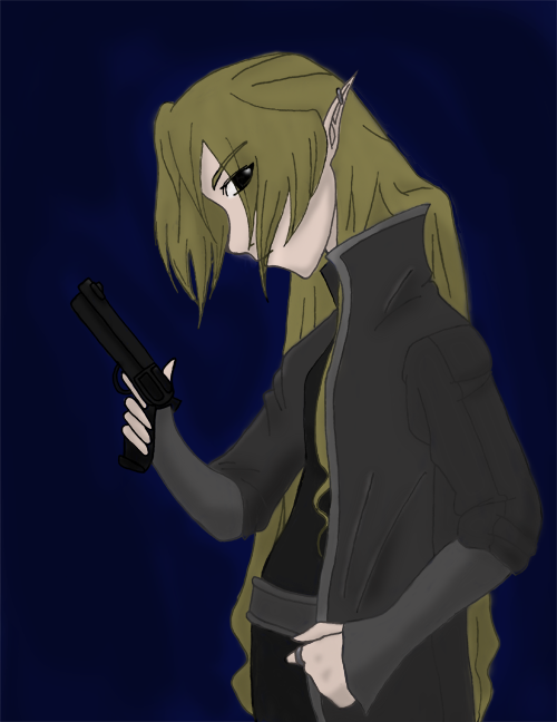
Mist by @Laprislazulknight88 (Elazul Jumi)

As you might notice, this image is the same as the one I loaded only a little while ago. However, this image was done a lot better than the last one. I found a tutorial that explained stuff and I think this version of the picture is really good ... for me that is. >_>

Category:
Rating:
Everyone
Class:
Finished Work
Submitted:
20y153d ago
Tags:
None
Other Work By @Laprislazulknight88

Comments & Critiques (2)

Preferred comment/critique type for this content: Any Kind

Posted: Tuesday, 22 June, 2004 @ 03:46 AM

So, what is this guy? is he an elf, or a fearie??? It's not a bad drawing, the shading is done rather well, the gun seems a bit small, and the eyes just a little bit too high on the head. The proportions are done good, except that the forward shoulder should be extended out more. It's the shoulder you see first, and therefor should be larger than the other one. This is pretty good, keep it up!... lol

Sincerely, Ikaika

Posted: Tuesday, 22 June, 2004 @ 09:25 AM

Well ... for one it's a girl. ^^;;

She just has a really small figure. >_>

But yes, she's an elf.

Thanks for the compliments on the shading, I just figured out how to do it on Photoshop and I think my drawing will improve because of it. That was the first ever gun I've ever drawn ... it's actually a revolver and I think I colored it a little too dark ... perhaps I'll make it lighter later. I've never really noticed the eyes but yes, they are a bit high up; I'll take note of that if I do another profile picture. Perhaps the shoulder should be bigger but the left arm isn't going out ... it's sort of just at an angle.

Thanks for your comment, it was really helpful! ^^
Leave a Comment

You must be logged in and have an Active account to leave a comment.
Please, login or sign up for an account.

What kind of comments is Laprislazulknight88 seeking for this piece?

  • Any Kind - Self-explanatory.
  • Casual Comments - Comments of a more social nature.
  • Light Critique - Comments containing constructive suggestions about this work.
  • Heavy Critique - A serious analysis of this work, with emphasis on identifying potential problem areas, good use of technique and skill, and suggestions for potentially improving the work.
Please keep in mind, critiques may highlight both positive and negative aspects of this work, but the main goal is to constructively help the artist to improve in their skills and execution. Be kind, considerate, and polite.