Thank you very much. I actually think the problem with her face is that her nose is a little too long, as well as being oddly curvy. As always, Ilove drawing eyes.Thanks for your comment! ^_^

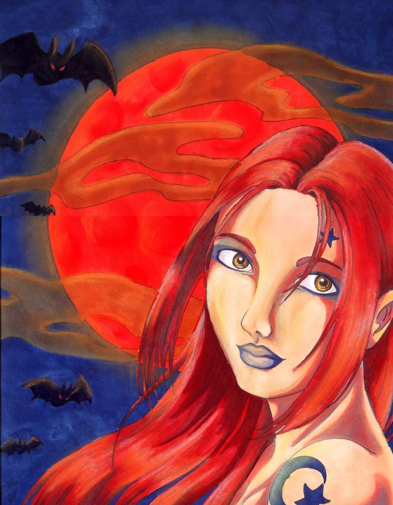
Harvest Moon by @aeryaval (Aeryn Avalon)
Just one in a series of Halloween pics I"m doing to celebrate my favorite holiday ^^ There are currently two more Halloween pictures in the works, but they're only in the lineart stage. i haven't had much time to work on them lately ;;
This pic is much larger than my normal drawing size...so large I had to scan it in two halves and paste it together in photostudio, which is why it doesn' tquite match up on the one side. I broke out my Prismacolor markers again for this one, and used Prismacolor pastels to add highlights and make things glowy. I'm used to mediums that blend better than the markers do, but pastels don't give solid colors as well, so I decided to try them in unison. And...voila! I really like the glowy effect I got around the moon, though the moon has craters and stuft on it that didn't show up in the scan >.< Things I dont like: Her face. Don't know why. I just dont' like it.
Inspired by Dan Brereton's Nocturnals. ^_^
Comments & Critiques (4)
Preferred comment/critique type for this content: Any Kind
Erin-chan, this pic is AMAZING! I absolutely love your use of color and red lighting. It's great! I am definetly going to try pastel on marker sometime... You know, the shading you did with the pastel is so well done, you really don't need the lineart. It actually looks a little 'off' on her face. You really do have your own style, and I love it very much.
You have to show me this "Nocturnals" thingy. Whatever it is. I love the bat! Glowy red eyes are awesome! When I come visit you, I am totally stealing this... :)
I love you, you're pretty, and I hope against hope that you'll be able to finish your other Halloween pictures soon.


Yay! XD you used red again, lol. This is done very well, all the coloring is great, the proportions on the face are very good, and the moon is cool, lol. i think the reason you don't like the face, is that the shading on the right side of the nose, is done a little bit too far down on the nose, which makes it look like the nose curves inward before it gets to the face. I also think that the top of the head is a little bit too flat, but i'm not really sure on that..... your' eyes, especially the detail in the iris's are done very well, i like the blush that you added. i like the lips as well, nicely done XD.
Sincerely, Ikaika