@migucast
Miguel Castaneda

Zelda Bookmark!
Zelda Bookmark! by @migucast (Miguel Castaneda)

I finally drew another bookmark! ^^ Well, technically, I drew a Metroid one first but I never finished it--It just didnt' seem as good as the one I made for Ogre Battle.. :\ Then, while playing Wind Waker, I got the idea to draw a Wind Waker bookmark! And.. I think I drew a pair of eyes and that was that. ^^;;;;;;;; And now, recently, after finishing the inking on ALL the piece of my big Zelda CG, I found that I could now start drawing something else, and I wanted to draw something Zelda soooooo.. I looked... And I still had the Zelda Bookmark on my To-Do List..... So.. I looked for my incomplete Wind Waker one and I couldn't find it.. :( So I decided instead to do one with the Oracle games since I'm playing the Second Quest in them now. :p

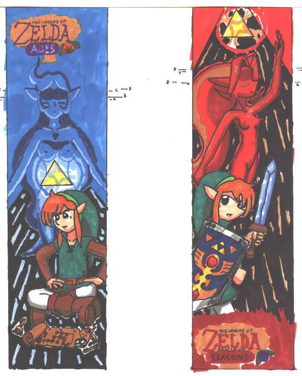
The idea for this bookmark came to me pretty quickly. Wisdom and Power. Pure and simple. Of course.... I didn't really know how to illustrate "Wisdom"... So... I just put Link on the ground, messing with his Dungeon Map. :p And of course, Link, ready for battles, means Power! :p As for Nayru and Din... I wanted to do something with the Goddess personas, instead of their "human" ones. And thus... You have them with their appropriate Triforces, as faceless energy beings like we saw them in Ocarina--Except with the Capcom "human" character designs. :p I also did the logos for the game MUCH better than I did the OB64 logo on the last bookmark, which was really squashed. :p

Anyway... This took a considerable amount of time to draw, especially, Link sitting down for the simple fact that I've NEVER drawn anyone sitting "indian style" as they used to say in Elementary School... ^^;;;;;; And.. Yeah, I know.. It's not perfect.. And Link's right hand is SO messed up! ;_;

The coloring was the worst though... It took ALL night to do! From just after dinner, around maybe 6 or 7 PM until WELL after 1 AM! I almost went through ALL -7- of my Zelda CDs! However, I stopped short on Majora's Mask, because Witch Hunter Robin came on and I had to get up and go watch it.... ^^;;;;;;;

As for the rating... I wanted to try and get away with a T(N) here... Buuuuuut.. Nadia said I should play it safe and make it an M(N) pic... Oh, well... Don't let the rating scare you kiddies! .. Er.. Wait.. This is so far down, you can't even read- Nevermind.. >_<

I used Prisma Color markers, silver and black Prisma Color pencils, and Nadia lent me her blue Micron pen, for Nayru. It wouldn't been nice to ink Din with a red Micron, but we don't have one.. :( So, I just inked her with the black Micron and then went over her line art with ... With... ............ Whatever shade of red I had decided would be her principle color. I can't remember which one it was now... I'm so tired and my right temple hurts from the marker fumes (YES, I had the window WIDE open but it didn't HELP!)... I go collapse now... [THUD!]

Oh... And.. Yeah.. Feel free to print this and make a bookmark out of it... [THUD!!!]

Category:
Rating:
Mature (N)
Class:
Finished Work
Submitted:
20y241d ago
Tags:
None
Other Work By @migucast

Comments & Critiques (6)

Preferred comment/critique type for this content: Any Kind

Posted: Thursday, 25 March, 2004 @ 07:10 AM

Wow, Red. Pretty cool. If I actually used bookmarks I might print one out. You usually have some fun concepts, I like seeing you carry them out.

[ Jansu's Biography ]

Posted: Thursday, 25 March, 2004 @ 03:59 PM

Like I said last night when you finally showed me the nearly finished product, "OH MY GOOOOOOSH!" This really is an incredibly impressive picture, sweetie... :D

I love the colors on the Ages side--blues are so beautiful! I'm glad my blue Micron helped! Nayru barely looks like she has an outline at all--she blends into the background really well! The aura around the Triforce of Wisdom is really neat, too--it looks like it's underwater! The cross-legged Link does not look bad at all, and neither do his hands! That must've been a tough pose to do... And the map looks really cool and detailed!

As for the Seasons side, I really love Din's pose--she looks like an elegant statue or something! Sorry I didn't have a red or brown Micron for you to use as well... But actually, it looks just as good with the black outline, since the black part of the background is what's behind Din for the most part. At first, I thought the effect around the Triforce of Power looked a little awkward because there was black in it as well as red, but the more I look at it, the more I understand the effect you were going for, and it's not really odd at all! Really, it's a great first attempt at something like this... Nice shiny effects on Link's sword and shield, too!

Looking at the original picture, it seems like the scan has more red in it, especially when you look at Link's hair, which kinda looks orange-y here, when the original was more golden, but it doesn't really look bad or anything, just a slightly different tone to the colors.

Goooooooooorgeous, gorgeous work! Make more bookmarks like this!
Posted: Friday, 02 April, 2004 @ 01:41 PM

Red, I'm very impressed. This might be some of the best work of yours that I've seen. These are much more colorful and compositionally complex than your usual work -- well done.

I think the Nayru bookmark is hands-down superior to the Din one, so I'll talk about Din first.

Link and Din's poses & coloring are really nice - particularly Link's shield. Great job with the shiny, metallic effects. Link's cool blues & greens contrast nicely with Din's rich orange and reds. Din's anatomy seems a little off...mostly her arms and hands. If you're going to put so much detail in her neck and breasts, you might want to pay more attention to her proportions and muscle groups in her arms. Just be stylistically consistant. Two nitpicks about Din before I move on: The bellybutton should probably be lower (or the crotch higher), and the dots on her cheek kind of look like a closed eye.

Okay -- kudos for using a background. This one looks a little awkward, but the colors you chose contrast well with the characters and make them stand out. Finally, the composition -- I love your elements, but their arrangement seems crowded to the left, leaving vacant background on the right. This is a very vertical composition -- vertical lines in the background, Link's sword & shield and Din's hand pointing up, all leading to the Triforce as the focal point. This all makes the right side of the image seem very empty. The logo on the bottom looks pretty good -- it creates balance with all the bright red in the upper area of the image. However, it does look kinda slapped on as an afterthought. Whew, okay. On to Nayru.

The Nayru bookmark is much better than the other one, and I'll tell you why. It corrects most of the problems I just described. The composition is wonderful! The logo fits in seamlessly with the image, and the balance of vertical and horizontal lines is just right. The map, Link's legs, his arms, Nayru's arms, and the logo balance out the vertical lines of Nayru's body and the background. Having the Triforce focal point in the center (its bright yellow really stands out against the blues, greens, and browns) is much easier on the eyes. GREAT job.

Nayru's colors look very mystical, and give a good sense of light direction -- the shadows on her cheeks do look like closed eyes though, like Din. The blue pen was a great effect. She also looks a lot more proportional than Din. Link might be my favorite part. I love how you tried a new pose -- the results are very good! Yes, the hands are a little out of whack, but other than that he looks great. You can tell that he's lost in thought and perhaps a bit frustrated. The map, keys, compass, and boss key are wonderful details.

Overall -- congratulations! You've challenged yourself and come out with some great work. Keep it up ^_^

Posted: Friday, 02 April, 2004 @ 11:17 PM

Thanks! ^^

Yeah, her left arm seems a little longer than it should, though I thought her hand looked perfect.. O_O;;;

I sort of understand the arguement about the neck in relation to the arms, but not the breasts... 6_9 Plenty of artists that draw very little details in all body parts still do breasts like that. ^^;;; But really... It's just a stylistic habit of mine... For some reason, I can't draw the neck with out those arteries, however, I've never been a big fan of musculature and most artists, specifically, the ones I look up to, usually ignore musculature when drawing general women. And since these girls aren't exactly DBZ characters... It would actually detract from the image, I think. Really, though... I think it's a matter of taste and style. I don't like drawing girls like that so I don't--yet, I still keep the neck arteries... Kinda how I don't do ear details... [SHRUGS] That's just the way I do it, I guess.. ^^;;;;;;;

And you're right about her belly button, buuuuuut... I don't see how the cheek markings (a stylistic habit that I'm not terribly sure WHERE I picked up) look like a close eye, though. The shading around the eyes and basic face structure should make it quite obvious where the eyes and cheeks are... So, I really don't know where you're getting that... ^^;;;;;;;;;;;

Yeah... I know... The right looks empty... Alas... It just came out that way... [SHRUGS] ^^;;;

Again with the cheeks.. :p

Hee hee hee hee!!! Thanks! ^^ Now, just wait until you see Rin! :p

Posted: Sunday, 25 July, 2004 @ 07:34 AM

These are pretty good, if you say these aren't your best then I'd love to see your ogre battle one.

Posted: Tuesday, 27 July, 2004 @ 05:20 AM

No, I said my Metroid bookmark that I never finished wasn't so good--this kicks the crap out of my Ogre Battle one, which is posted somewhere in the bowels of this gallery. :p

Leave a Comment

You must be logged in and have an Active account to leave a comment.
Please, login or sign up for an account.

What kind of comments is migucast seeking for this piece?

  • Any Kind - Self-explanatory.
  • Casual Comments - Comments of a more social nature.
  • Light Critique - Comments containing constructive suggestions about this work.
  • Heavy Critique - A serious analysis of this work, with emphasis on identifying potential problem areas, good use of technique and skill, and suggestions for potentially improving the work.
Please keep in mind, critiques may highlight both positive and negative aspects of this work, but the main goal is to constructively help the artist to improve in their skills and execution. Be kind, considerate, and polite.