@aeryaval
Aeryn Avalon

CAUTION
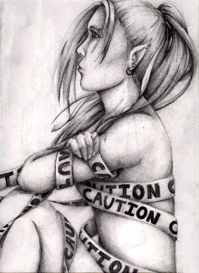
CAUTION by @aeryaval (Aeryn Avalon)

I don't know what possessed me to draw an elf wrapped in caution tape...but it definitely reflects the way I was feeling at the time. It got cut off in the scan...but there's script at the botton that says 'loneliness' SO perhaps the caution tape means 'stay back-dangerous emotional zone ahead' And making her an elf...perhaps there's a lot more of myself in this than I realized. this is also much larger than I'm used to working with, too...this paper is 17x22, I think, and I'm only used to 8.5x11. Plus, it's a profile, which we all know is always hard...so yeah, I'm rather proud of it. The only thing I don't like is that the pencil smeared because I didn't spray it...but c'est le vie, I guess. Enjoy.

Category:
Rating:
Everyone
Class:
Finished Work
Submitted:
20y60d ago
Tags:
None
Other Work By @aeryaval

Comments & Critiques (3)

Preferred comment/critique type for this content: Any Kind

Posted: Thursday, 23 September, 2004 @ 12:26 AM

Very artistic. The shading is exquisite - egads, the fingers! - and the caution tape is wonderfully rendered. I also love the flow of the hair, and the way you gave it so much shape in the shading. Her eyes are a little high up her face and her chin's a bit close to her neck, but it's very lovely work otherwise. Great feeling, again. You're very expressive in your art, and that's what's important.

Posted: Thursday, 23 September, 2004 @ 10:26 AM

This is really one of your most expressive works. I really, REALLY admire the shading on this one--you've done such an excellent job. The idea behind the caution tape is really, really cool (I have to borrow that sometime...) I like the expression in her eyes, and the individuality you've given her with her many piercings in her ears.

Now, the profile... You might actually want to borrow one of my How to Draw Manga books to work on them. Even though they are more anime-style, they still show the basic idea behind drawing the side of someone's face. Your main problem is that the profile itself is way too flat and long. It helps to think of the shape of the skull--it's very round, almost circular in the back (though here you have it rather oblong shaped) and the face kind of takes on that curve, a bit, though it sticks out more. Erk, I don't know that I'm making sense, but yeah. I'll show you in person sometime, ne?

Keep up the great work. It's good to use art to express yourself, and I'm sorry I wasn't there when you were at Governer's school to give you a big freaking HUG.

Posted: Friday, 24 September, 2004 @ 02:36 AM

Those are some of the best fingers i've seen as of late. I must say, that the shading is done tremendously well. The only thing i would note, as has been stated, is that the eyes are a little too high, and also, the face looks strikingly similar to your' "blaize" picture, a more feminine, but still similar. overall, really nice work, and great detail.

Sincerely, Ikaika

Leave a Comment

You must be logged in and have an Active account to leave a comment.
Please, login or sign up for an account.

What kind of comments is aeryaval seeking for this piece?

  • Any Kind - Self-explanatory.
  • Casual Comments - Comments of a more social nature.
  • Light Critique - Comments containing constructive suggestions about this work.
  • Heavy Critique - A serious analysis of this work, with emphasis on identifying potential problem areas, good use of technique and skill, and suggestions for potentially improving the work.
Please keep in mind, critiques may highlight both positive and negative aspects of this work, but the main goal is to constructively help the artist to improve in their skills and execution. Be kind, considerate, and polite.