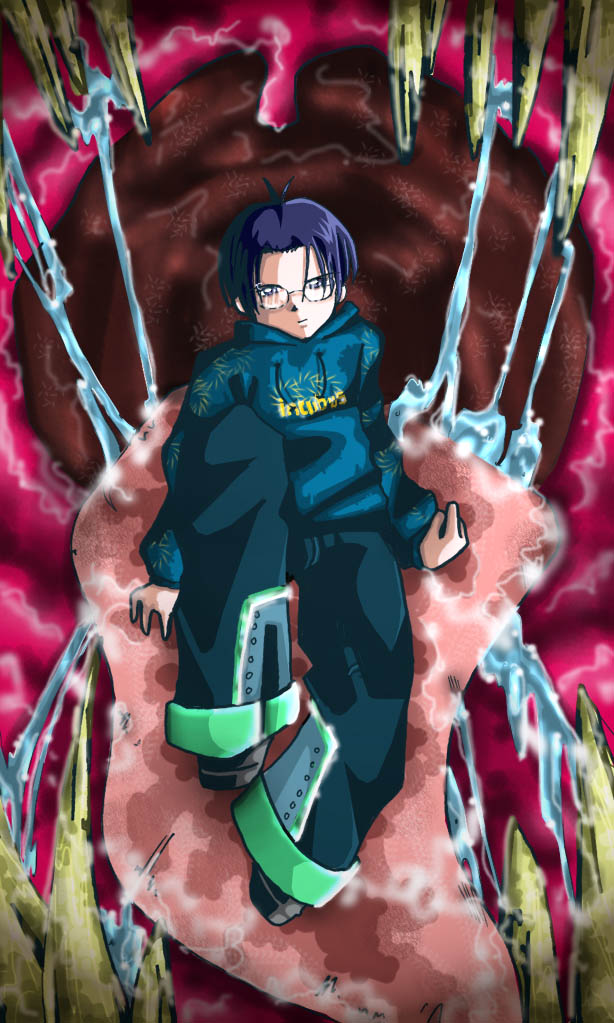
Hm, good concept...But I think (maybe) more muted colors for the mouth might've worked a litlte better...and again, I think we need to see a bit more of the environment to make more sense out of it. It just doesn't quite come across as threatening...
Also, perhaps more sense of depth/cavern-ness to the mouth would establish the environment more?
my art: www.side7.com/art/daniwill


haha, that's awesome! detailed saliva and all that.. awesome X3