@Jansu
Brandon Ballenger

Red Scribble
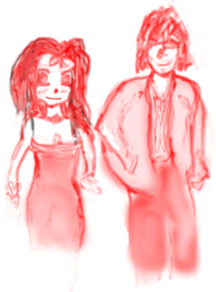
Red Scribble by @Jansu (Brandon Ballenger)

Just playing around in Photoshop while I'm bored, trying to do something new in the process. I find a little more versatility every time.

I kinda like it, I guess.

Category:
Rating:
Everyone
Class:
Rough / Concept
Submitted:
19y342d ago
Tags:
None
Other Work By @Jansu

Comments & Critiques (4)

Preferred comment/critique type for this content: Any Kind

Posted: Monday, 13 December, 2004 @ 07:04 PM

Gee, I wonder who these two could be...? =3

They look really adorable, Ja-kun! Especially the girl's face--she has such a cute expression! And they look like a nice little couple... ^-^ The poses turned out really well, and the color choice and airbrushing are really pretty, too--sometimes simplicity is just as nice as something complicated. The hands are a bit awkward, though, probably because they look too small. Is the guy's right arm not in the sleeve? It looks like that... Also, the girl's dress might be a little... low...? ^^;;; Or is it supposed to be? ^^;

I like this picture, too... More sketchies! =3

Posted: Monday, 13 December, 2004 @ 07:11 PM

Nobody I knoooow.

Thank you, Nadi. It was all just one unwavering color choice, though, that either stayed a dark red or faded to some degree depending on how I did it. I didn't pick out different tints per se and lay them down. :)

And yeah, they are awkward - they're not even fully formed. I wasn't even paying much attention to anatomy, honestly. And the guy's wearing a light jacket, and his arm is in the sleeve, and his hand is in the pocket.

As for the dress, uh. I guess it is kind of low. ^^;; I wasn't really paying attention, just scribble scribbling. =3

Thank youuuu.
Posted: Monday, 13 December, 2004 @ 07:17 PM

Mm, correction - the strap of the dress was an exception, but I didn't specifically choose out black there, either...it was just about the first line I drew, and when I started I had things fading to dark instead of light. I'm not sure why I left it, really.

Posted: Monday, 10 January, 2005 @ 02:59 PM

Very cute, Janus! You did a great job of conveying motion -- I can tell from their posture that they're walking along together even though the legs aren't really visible. It looks like the girl is walking a little bit ahead of the boy and he's checking her out :)

Leave a Comment

You must be logged in and have an Active account to leave a comment.
Please, login or sign up for an account.

What kind of comments is Jansu seeking for this piece?

  • Any Kind - Self-explanatory.
  • Casual Comments - Comments of a more social nature.
  • Light Critique - Comments containing constructive suggestions about this work.
  • Heavy Critique - A serious analysis of this work, with emphasis on identifying potential problem areas, good use of technique and skill, and suggestions for potentially improving the work.
Please keep in mind, critiques may highlight both positive and negative aspects of this work, but the main goal is to constructively help the artist to improve in their skills and execution. Be kind, considerate, and polite.