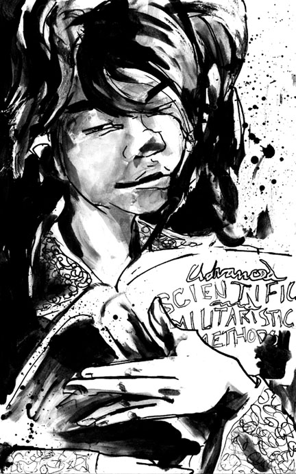
I really like this piece. It is so rhythmic and the stylization is great. I love how you used black and white, no colour, it just adds to this somehow. The only gripe I've got is the title of the book. The letters dont seem to fit it. They look very odd as only outlines, I think they need to be filled in. Other than that it is amazing. Great work!

some new ideas by @srom (srom noname)
wow, i've known athena for quite a while.. but i've never drawn any of her super-high definition characters... UNTILL NOW!
this is for the character exchange on the forums... i got a little excited about drawing THE QUEEN, can you tell?
Comments & Critiques (4)
Preferred comment/critique type for this content: Any Kind
i'm really glad that you said that it's rhythmic, cos i based the composition entirely on triangles and wondered if anybody besides me would care. and black and white totally rules in my house, tho i am trying to see and use colour in my pieces more in my work (mainly cos i almost failed my colour classes in school, hee).
as for the lettering, i went over this piece later with the grey ink because the grey ink is cooler-toned and the blue-ness of her face was REALLY BOTHERING me. that's why i scanned it in grey scale and not full colour, cos THE QUEEN looked hypothermic, and i do not allow hypothermic queens in my studio (aka my room...). so i evened out the grey, and maybe i went over the letters, but i don't remember because i eventually sent the original the Athena herself, which is pretty cool.
thanks so much for the comment, yo. i'll see ya later.
Well, my art teacher constantly stresses triangular composition and the rhythm it creates, so I figured I might as well apply that to comments. I too am not a fan of colour, I would prefer to just stick with greyscale mediums like pencils. They are my friends.


Oo! FUN WITH SWOOPYDRIPPYINK! Lurvely! And I love the swoop to her hand, so cool. SO COOL. And...very appropriate book. ;) With those half-closed cat eyes...XDDD YEEE GO SROM DANKU!!!