Two Years Too Long.... by @migucast (Miguel Castaneda)
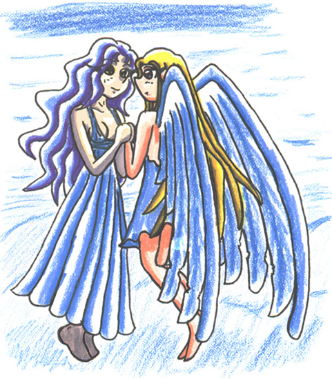
Somewhere over two years ago, French artist, Maeva (http://www.kujamav.fr.st/) won at the MAG and got the covited position of having people draw her characters for the next MAG. Though I can't remember HOW I came upon her site, I absolutely LOVE her art and wanted to do that MAG for her! However... By that time... I had quit doing monthlies because I could never draw anything good by the deadlines and always felt I was gipping everybody with my horrible, low quality pictures.. :( In the end, I didn't enter the MAG that month, but I DID personally promise her that I'd do a gift picture anyway because I loved her work so... Then... 6_9 Things began to happen... If you've been watching our saga here, you know the story... Two bad monitors, dead scanner, Windows ingesting it's own guts... Basically... Thanks to all of our hardware problems and our extremely empty wallet, it took almost two YEARS for this picture to go from sketch, to inked, to colored, to scanned. Of course, the worse part was that while I colored it in Prisma Color pencils (Maeva likes natural media a lot more than CG), I didn't have the right pencils to do Luriah's (the girl on the left) pale skin... :\ You may recall I had a similiar problem coloring Tomoyo for Nadia a few years ago. I tried to improvise but for some bizarre reason.. I picked two REALLY whacked out colors that thorough RUINED a perfectly good picture! I won't say which but... The point is that I was disappointed at how I managed to screw up something that was coming out so nice... The only answer was to fix it in Photoshop but I was hesitant because I didn't know HOW I'd do it... So, I put it on the back burner until I thought I could do it right. And tonight... I got the night off, thanks to Hurricane Jeanne and had nothing to do (I WAS playing Skies of Arcadia, but I had to quit for Adult Swim)... So I decided to finally FINISH this picture! And... I did the best I could.. -_- I'm not sure if it even looks right, but at least it looks better than the original.
Anyway, these are Maeva's beloved characters, Luriah and Ephikiel. I'm not sure I captured them well, but I hope she likes it. ^^;;;;;;;;;;;


Sorry it took me a month to comment, Red.
This is nice, and I'll bet Maeva approves! I like the suggested background and the way you did the wings - they're all one blue color but the way it goes from solid to a bit more spaced-out almost makes it look like a gradient. The light/shading helps too. As for the skin, I think both look fine, and I actually like Luriah's skin better, I think. It looks natural and less bold than what I'm used to from you.
I can't really comment/ask questions about the character designs since they were made up by somebody else, so I'll leave it at that. Looks good.