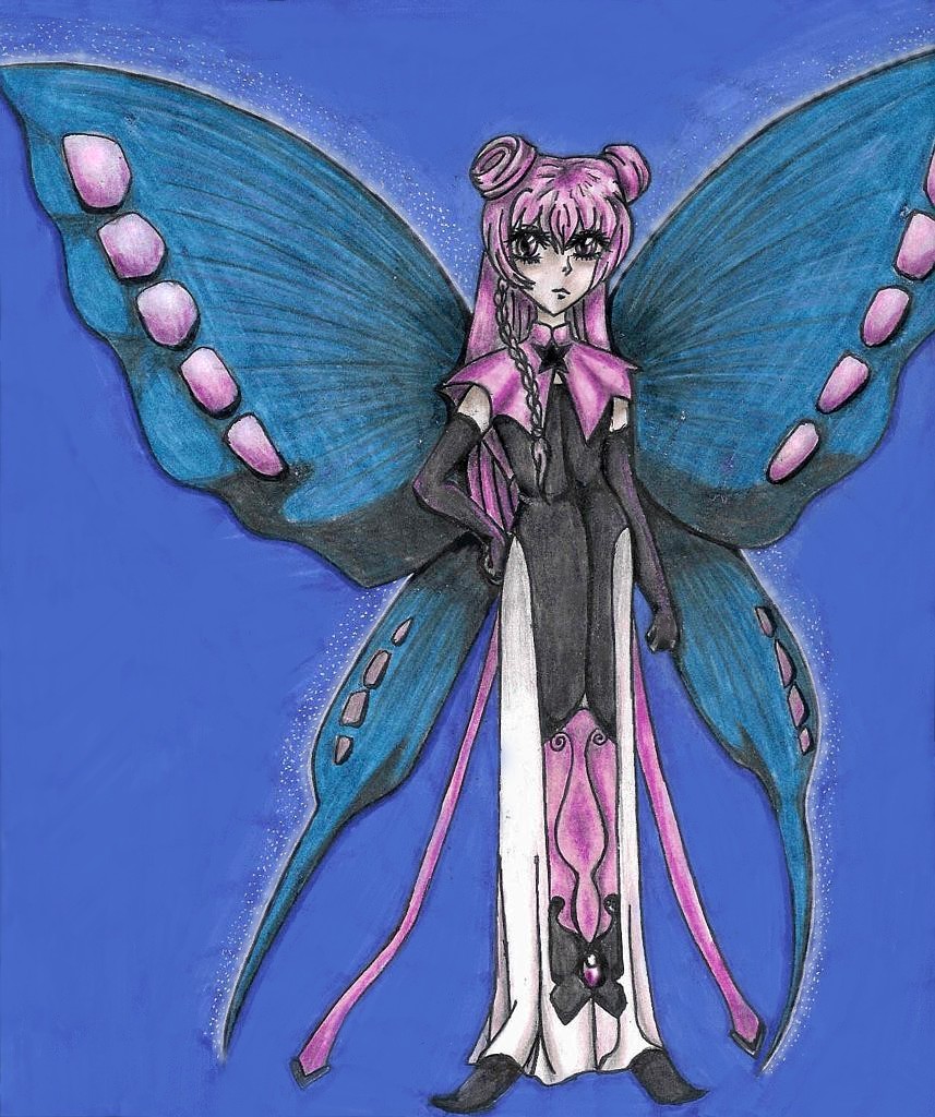
Ruby Moon by @Cyanide (Ana Nyte)
Fixed the terrible straw background, it looks more smooth now. I like how Ruby looks like a kid in this one a little nicer then he/she looks in the anime/manga.
Category:
Rating:
Everyone
Class:
Finished Work
Submitted:
20y335d ago
Tags:
None


THis picture actually looks much better when you open it then it does on the thumbnail, maybe that's why no one comented on it before. First thing is first, that background is horrible, but you probably know that already, so I don't need to tell you that, I taught you better then that. I like the face, hair and wings though. You made Ruby look like a child in a way, but that's kind of cute too. The dress could look better then that, the lines could look a little less misplaced since I can tell you were going for a more symetrical look here which didn't quite turn out as I see. Your shading has improved and congradulations on the inking, you finally got it right...kind of, lol. But overal, I really like this picture, so don't mind my nasty comments, they are there just to annoy you ^_^ oh...and buy a new blue marker, that one was probably dying while you were doing that background shudders the straw has got to go.