Yup. He's always been quite memorable. Too bad he has yet to appear in any of the newer Zeldas (Okay, so he's in the Oracle games, but still)... I guess he's just not as popular as Dodongo or Gohma... :\

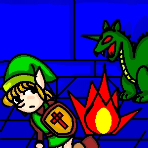
Aquamentis Fight by @migucast (Miguel Castaneda)
Old oekaki. REAL old. Anyway, it's what it says... Link fighting Aquamentis. :p
Comments & Critiques (8)
Preferred comment/critique type for this content: Any Kind
Well even if it is old, it has that classic Link feel to it. Link is by far the most awesomeness of awesome nintendo characters [avoiding my deadly obsession with PS2] and you captured him in a lufferly, simple way. Makes me feel warm and fuzzy inside. Ayup.
Yup. Based on Miyamoto's original character design from the first game. At the time, I was really into drawing the old style Link since everyone else only knew how to draw Z64's bishounen Link (not that I have anything against Z64, I love it... But I always have this urge to claw the faces off of bishounen whenever they come across me... [twitch, twitch])... I'd really love to do a really GOOD CG of first game sometime... Assuming I can get out from under my current work load... ^^;;;;;;;;;;
Tsk, tsk, tsk! I prescribe 60 hours of Wind Waker and Soul Caliber 2 GC. :p
Thanks! ^^
Thanks! ^^ I've always been inspired (even before I could draw) by the awesome artwork that came with Zelda's manual. This oekaki came from an era a couple of years ago when I was drawing various pictures based on Miyamoto's original designs... Alas... The majority of those pictures sucked... But one day...! ONE DAY!!! I'll make one that TRUELY testifies to the awesomeness of the original designs!
Awwwwwwww, widdle Wink-y-poo... :D This oekaki turned out very cute and cartoon-y--definitely fits the style of the original Zelda's art! The fire looks a bit goofy, but it really fits the style of the pic, so I can't complain... Did you do some sort of effect to the front of the shield, or is it just the compression? Either way, it's kinda neat... I'd love to see you do some more Zelda oekakis!


Cool. Aquamentus was always my favorite monster... Sure he's weak, but you gotta admit he looks cool.