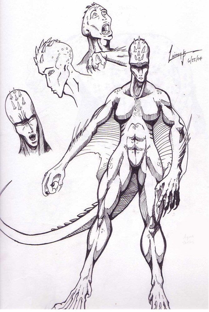
errr yeah this critter was suppost to look sorta female, but uhh hehe i think that part got lost in it's design.
and the swimmin' like a croc-person was what i had in my head at the time of this doodle. hahah love the idea of moving like a stingray!
@lainburt
Lainey Burton

err i had sudden inspiration to do something reptilian + aquatic and this is the result... that left hand though didn't want to come out right.
Preferred comment/critique type for this content: Any Kind
Nice job, Only a few things that need work, like you said, the left hand, the middle finger is too thing, and the right finger next to it, is too thick. Also, the tail is kinda off proportion. when going behind the leg, on the bottem it looks flat, and then it gets a little thicker after words. I think just adding a little more curve would fix it. The last thing i would say is the chest, it just looks off somehow. That is probably by design though, so don't mind me. good job, i like the expressions on the faces, and i really like the shading on the right hand!
Sincerely, Ikaika
LOVE the lineart/shading. It's very comic-book superhero-y! The top two headshots have cool expressions on them, but I really like the alien-looking third one. It looks intelligently dangerous.
I like the web design - though I imagine this guy (s'very androgenous - I can't really tell!) would swim rather like a stingray - flap, flap, flap...