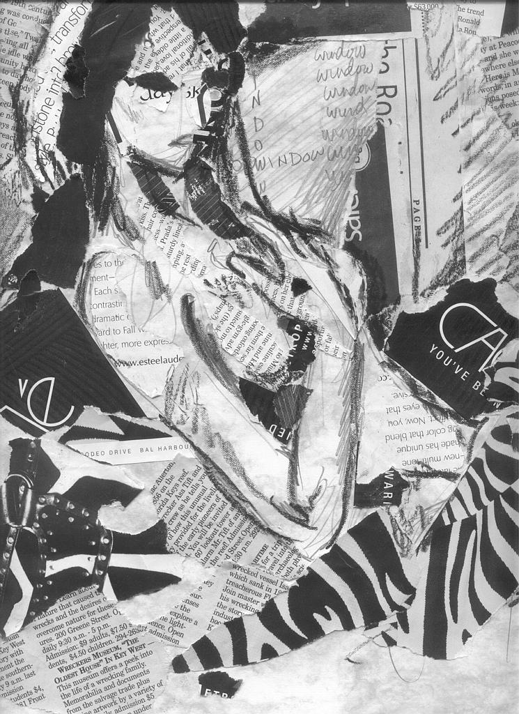
i like it having worked in the past in collage and having done some grassroot papermaking (texture/ colour experimentation) i truly enjoy this medium you have done a good job on this one- your composition is quite strong- but i think you went BIG almost too big with some of your pieces- sure it gives you a real and/or slapped together look, but you might do more with smaller pieces... you really mastered the constructing part of the work- leaving corners up- almost looks like the pieces of paper have blown together by chance or miracle to form the picture... there are so many directions to go in this art form- could try with coloured text mixed in or make the text actually relate to the picture... try some more- you seem to have the knack

Dis by @iaera (Danielle Bertocci)
This is a little graphic design text collage assignment. Dis is referring to Hades. Just because. Done mostly by collage, but with some pencil and oil pastel in there.


WOW! I'm so amazed at the materials you used here--I've never seen something like this on Side 7! It's truly amazing! The image was actually easier to distinguish in the thumbnail--there is just so much going on, my eyes get distracted. But I really love it. I just can't explain how cool this image is. Keep this up--collages are really cool!