Thanks for the critique! ^_^ I've got no problem with clean line, usually I clean up my drawings with technical pen and colour it there after, but this was an image scanned out of my sketchbook and coloured as an afterthought, just to see if I could do it properly. But I see what you mean, it does look sloppy. Thanks again!

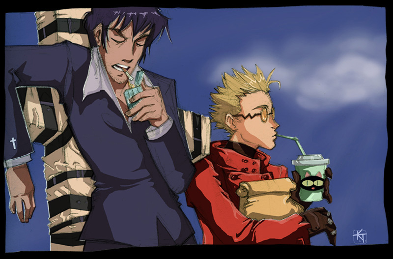
Vash and Wolfwood by @KT_SHY (KT SHY)
I did this one quite a while ago actually, after an image I'd sketched in pencil into my sketchbook. I coloured it in photoshop and am actually quite pleased with the colours, they're kind of bright and animation-ish. It depresses me now to see that the perspective on the cross is slightly askew... you know, you never really notice these things until they're all coloured. Gah!
At any rate! I'm pleased to announce that I've finally got my own web page up! cheer So please check it out as I've infinetly more images there than I do here at Side7 (I only have the 2 per day upload right now... sigh).
Comments & Critiques (3)
Preferred comment/critique type for this content: Any Kind
Scratchy lines smatchy lines, it looks good! The scratches and faded lines actually give it more a distinctive look. Like...old-style pulp-adventure heroes, updated and colored. I like.
The cross....Okay, I can kind of see how its off. Wolfwood's right hand also looks a little disproportionate. But his face! Dang, that's a cool face! That alone would make the picture worth-while.
...And you incorporated the black cat. Heh.


This is an excellent composition--the poses really capture the characters (I love that Vash is eating, and Wolfwood smoking!) You've really done a great job getting the animation-style coloring--the cel shading is well done, and I like the floofy clouds in the background.
The only thing that I feel needs work is your lineart. The sketchy pencil lines are distracting. Have you tried using layers to trace over your original lineart before coloring? It's pretty simple if you have a tablet--if not, you could try doing it with a light table and a fresh sheet of paper (or a window, if you have no light box) This would add to the professional quality coloring you already have to have a nearly pro-quality finished iamge!