Hello again ^.^
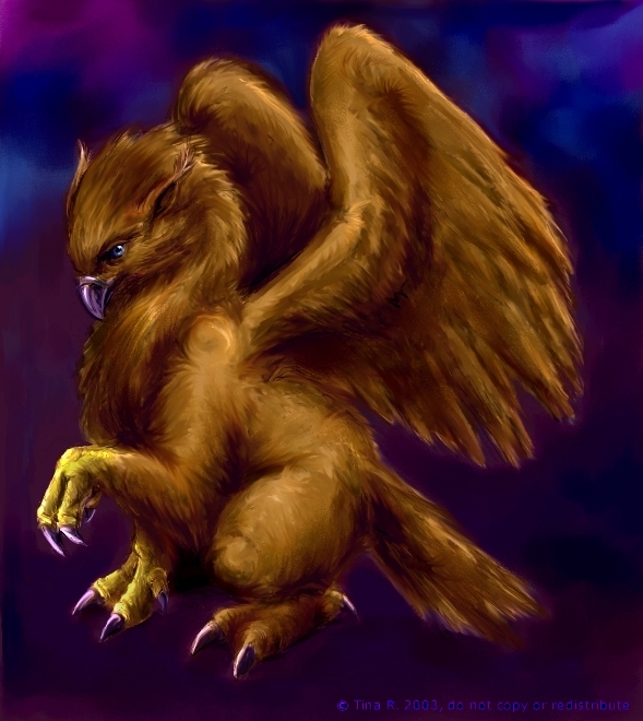
After commenting on your picture of Bellatrix, I decided to look at the rest of your gallery, and saw this. It's soooooooo cute! I want one lol ^.^
Your attention to detail is great, and so is your use of colour. The warm on cool colour scheme really brings all of the attention to the Gryffon, really makes it stand out.
As for advide regarding backgrounds, I'm not so sure you need it, this background is really nice, especially the colour (as I talked about above).
I look forward to seeing more of your art, you definatly have talent. :)


This caught my eye 'cause of the shading on the fur. :D So fluffy and golden! Painter, right? I must figure that prog out someday. I love the smooth, glittering, metallic look of the beak and eyes. My only nitpick is that I wanna see her long, primary feathers, but ... hmm.
Backgrounds are tough, man. I guess my advice to you would be: Have patience / pace yourself with the background, and try to get it done before starting on the main figure(s). his is frustrating at first, yes - I know I always wanna get started on the characters before touching the background. For the record, those pictures of mine always end up with a not-as-impressive backdrop.
But yes. As you develop the background, it'll usually look better and better, and you'll say "aw, I feel so complete!" Dinking around with the background is a tedious, but rewarding thing to do. The End. :)
(P.S. - of course, not every piece needs a zuper detailed background. if you did that, you'd burn out!)