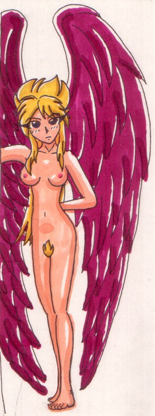
Exactly... It's frought with problems and just isn't right. :\
That "X" mark is an ankle bone... :p
@migucast
Miguel Castaneda

I tried to do another picture with feet. And it turned out absolutely awful... :\ Oh, well...
Preferred comment/critique type for this content: Any Kind
I don't think the feet are all that necessarily bad! And I knew what the 'x' DP was talking about is, so don't worry. =) DP seemed to have a lot more detailed comments, and I don't really have much to add to those.... I'm kind of jealous, though, because I've always wanted to draw Nina, but it comes out horrible because I can't draw wings at all. =( Good job, though, and don't be so hard on yourself.
I'm really fond of this one, Red. I don't think it's awful at all.
I'd say the "x" looks more like a >. I think perhaps it's a little high but it's hard to say. I know Nina has some complex hair, and you did that pretty well. The wings are also nicely done, and you show your typical adeptness with the shading here. I hope you'll try this one again sometime, you can never have enough nude Nina.
How is it necessarily bad? Granted, there could have been a slight size difference between the big toe and the others, but I'm not an expert on toes myself. In fact, I would say that I have no real experience with drawing digits such as fingers or toes in the first place!
Regardless, I don't necessarily see the problem in this picture. Granted, the "x"-ish mark near Nina's left ankle is a little bit odd, but it's not really out of place. The only thing I would probably adjust would be the arch between Nina's left pinky toe and the rest of her foot. The arch just seems to be quite a bit high, considering that it seems that her other toes are lying on the floor. Now, if the other toes were arched, with the tips of the toes coming in contact with the floor, I could see where the pinky arch would come in, but as it stands the pinky arch can be diminished.
However, that's just my opinion. I could be wrong. ;)
Aside from that the rest of the picture is excellent! The only other thing I would adjust would probably be Nina's right arm, since its position just seems a little bit awkward, as if the upper portion of her arm closest to her torso should be more connected to her shoulder blade.
Oh, and the positions I'm stating are basically from Nina's perspective. So, her left foot would look like her right foot to someone just viewing the picture. I'm insane like that. :D
[ Dark_Paladin's Biography ]