It doesn't look girly.. It's quiet nicely done. But it's the face which bugs me. It should look smaller since it's farther away, but actually, it's the thickness of the face which scares me..

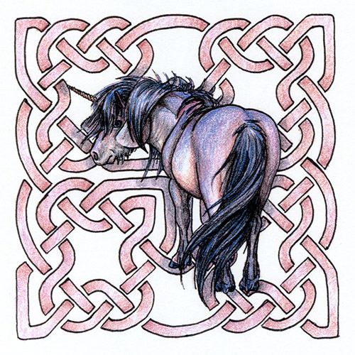
Unicorn on Celtic Knotwork by @dragelph (Joce Weir)
ummm...k this wasn't oringinally supposed to look so incredibly girly...the original is more into lavender hues but the prints (that this is scanned from) added more pink to the beige and laveneder combo in the shading.
This pearlescent looking pony was layered over and over with colour to get that fantastic colour! I really had fun! The color itself helps to define the full round build without too much shading work to distract from the magickal feel.
The drawing was originally just an inked sketch but I added the celtic knotwork intot he background becasue I felt it needed a little soemthing extra and I think it worked. Its a light and airy piece that I think would look great in a pretty little bedroom!
There are five prints of this piece for sale. The actual prints are nicer than the scan. Very rich and not as rough as the scan makes it look. The prints will be very affordable so just email me for more info!
Comments & Critiques (3)
Preferred comment/critique type for this content: Any Kind
The face may look large but its becasue the head is large. I used a pic of a shetland pony for reference on the position. Its a pony rather than a horse so the features are thicker and more rounded and the lower jaw is haired becasue of the climate these ponies are adapted for. It may look "scary" but its the natural look of the pony I used.I just added a horn.


Aaah, I love your sense of colors. And the expression of the unicorn works really well. Good job, also, on the difficult view.!