Min by @Bix (Meghan Kirkpatrick)
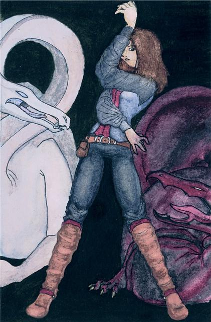
The last of the five cards. I was still getting my watercolor skills down, so it's a bit sloppy. I like how the red dragon turned out... I was trying for some symbolism, here, yah know, the Aies Sedia vs Rand w/ Min in the middle... nudge nudge, wink wink... nevermind. - -;


I've never read this book, but I'm really loving the composition of this image. It's just great with the character in the middle--her pose is just so beautiful. I really like the colors as well, although I feel there should be a few more highlights--the overall feeling is just a tad too dark. I need to check out the other four images... Stuff I did for school was never this awesome.