Gee..thank you very much ^ ^

Comments & Critiques (6)
Preferred comment/critique type for this content: Any Kind
Posted: Sunday, 10 October, 2004 @ 10:55 PM
One word: Yum.
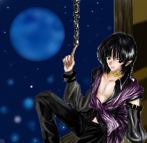
And some more words: Excellent shading here! You keep getting better and better. The only things you should work on now is lineart--whether to keep it or eliminated it altogether. In some images like this, with such superb and realistic shading, you might want to get rid of it altogether, so it doesn't interrupted the flow of the images. In your others it fits, but in this one it might not. You know?
This guy's pose is very daring, very sexy. I love the shirt falling off, and he has a very cute face. What is he balancing on his hand, though?


FANTASTIC WORK AND SHADING.........SHIRLEY