hee..Thank you very much.
For your commenting, next time I'll do it better than this. I always got some problem about how they turn their head..or again, look like someone has a big head than it can be? huh..nah..sorry my Uristheus..
@holymiracle
holy miracle

Gee... Took so long time with this picture. (I've got much thing to do... Three days with this pic TT^TT!! ,because I must do my website,too - -!!)
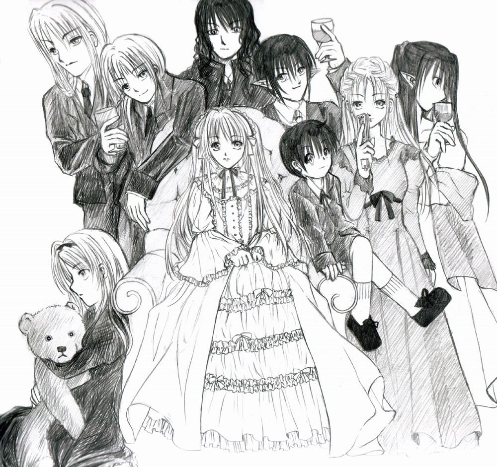
All character from my fiction again, but in 18th century form ^ ^. (Think, I've read too much God Child..>w<~)
The name..top, right to left. Uristheus,the edilon of a girl who sit with teddy bear. Silver Hegndra,the knight of Sarendia. Violet, a devil who not interested in wars. Silent , a mystery musical with a power to control people. Wassery, a goddess of waterfall -Mille-. Blackcrystal, a elven forturne-teller.
A girl who sit at sofa is Lunar Crusander,the princess of Arentia. A boy who's on her side os Nemien,Violet's edilon. And the girl who hold teddy bear is Miracle Stainford,the last summoner girl in Arentia.
It's so dirty work,right ^ ^!! I'm not good in clean works,thought - -!! Sorry for you,too. my lovely character.
Preferred comment/critique type for this content: Any Kind
Holy smokes... this is beautiful. ^__^ I'm jealous. This would take me much longer than 3 day, well maybe if I worked on it constantly almost 24-7 those 3 days but still. All the little details and folds are outstanding. The layout is also outstanding, like the other person says you are lead easily through it. Some of the heads are sort of large, like the guy in the top left corner. I am so impressed with this. I'm defenatly going to keep an eye out for new stuff in your gallery. Dont mind if I add you to my museum do you?
Thank you for commentung ^ ^//
It's true that someone's head is too big..It's my fault. I'm worry that I can't draw that one into this canvas. thought, it too small to draw too many people..?
Add me on you museam..? ^ ^ thank you very much >w<~ It's my first time that someone add me on his/her museum ^ ^
Very nice, I like the detail in this image. The fact that there is so much overlapping adds a lot of interest to your piece. You are lead though the composition easily, it is well set up. And I must say your skills in manga are so good anybody would envy them. The only criticism I can give is that some people's heads look twice the size of others, I would try scaling those down a bit. Good job, nonetheless. You don't even need colour what with the lovely textures you've added.