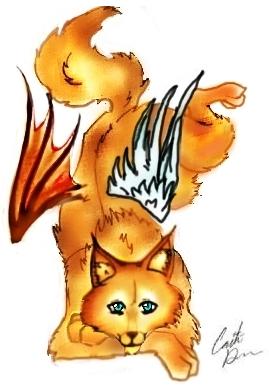
The composition of this image reminds me of those Japanese wall scrolls--I feel like he should have some kanji in the background. :) I love the coloring--the way you've shaded the fur reminds me of the flames in a bonfire, only blurry, which is cool, and I think that you've worked a difficult pose pretty well. It isn't quite clear, yet, however, what angle we're looking down on this character from--the face is kind of like we're seeing them head on, but the body is like we're looking down on it. I do see where you were intending to go, though, so I think you've done a pretty good job so far, and I am really impressed that you're trying poses that are unique and not easy, instead of doing what many artists do and just stick to what is easy and often-drawn. The angel wing isn't anywhere near as amazing as the devil one--I love the shape and color of that one. Ah, and before I end this comment, I have to tell you I love the face. Those eyes are so clear and innocent--truly beautiful, like the meaning of the name 'Lucifer'--"bringer of light."

Lucifer by @Luna_FoxFire (Caitlin D.)
A little creation of mine ^^ I like the way that the colors came out, expecially the demon wing. The angel one isn't _SO bad, but I think it could be better >.<;; anywho, comment please.
Category:
Rating:
Everyone
Class:
Undefined
Submitted:
19y350d ago
Tags:
None
Comments & Critiques (3)
Preferred comment/critique type for this content: Any Kind


I don't think that you should have done any wings at all. It would have looked great all by its self. Try taking the wings out and seeing how it looks to you.
[ Alliesmith's Biography ]