laughs. Yeah, I wondered how I was going to adapt the pic when I saw it. I like what I came up with, though.
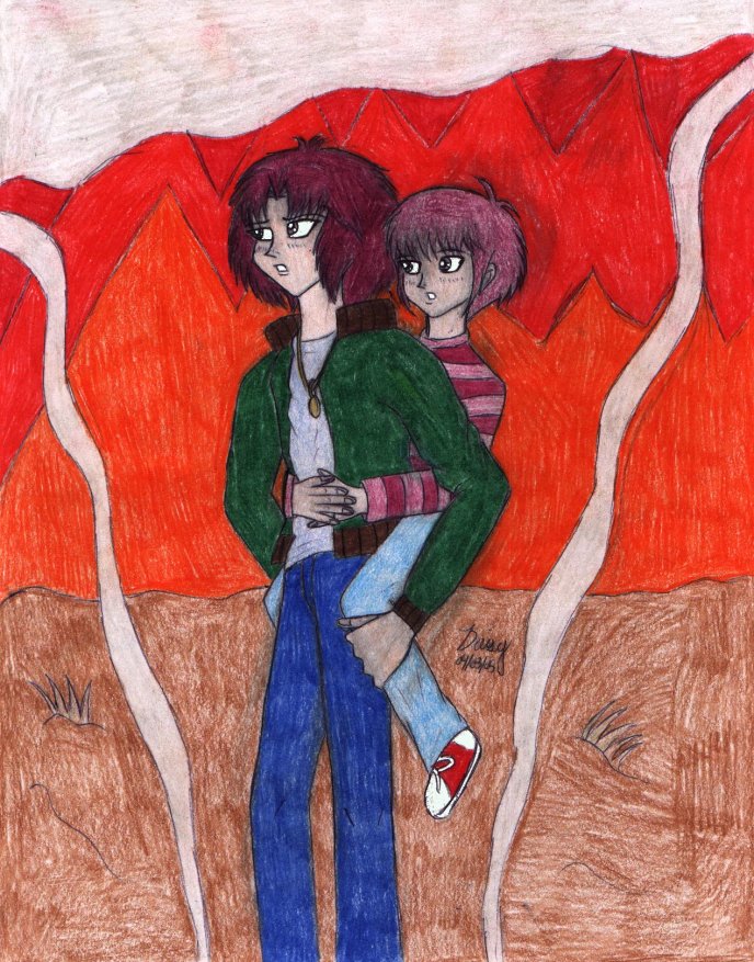
And unfortunately, those are flames. XD; I'm very bad at drawing certain backgrounds. It was supposed to be a wall of flames, but you're right: waves would make it look better.
If this comes through multiple times, it's Yami Marik's fault. XD;


Ah, here's the one I've been looking forward to commenting on for awhile now, but didn't want to neglect the previous pictures ^^;
First of all, I'd like to compliment you on not just ripping the pose off from the actual cover. It takes creativity to come up with your own pose, and I think this one is very cute (and Miruko would've looked sort of weird jammed into a baby-snuggy, anyway o.o; )
Miruko's foot looks perhaps a touch over-simplified (as in, rounding his jeans more around it would probably solve everything^^;), but his hands are nicely detailed. Amelda's hand is nice, but I think the bizarre knuckle-staggering comment I left a few pictures back would make it even better.
Er...the fire in the background should probably have a little more...wave?...to it, just to make the flames appear more alive and flickering, and adding a few other warm colors to them would increase the depth quite a bit. Unless those aren't flames, in which case you can just totally ignore that comment ^^;
The locket around Amelda's neck is a very nice detail, and what caught my attention when I first saw the picture ("Lookit! The locket! Squee!") And I like that outfit on Amelda...I'm forever under the impression that green looks awesome with fuschia hair. ^_^
This is a really cute picture...sad, but really cute...