@Ruu-chan
Aurora Collins

Vampire Crocell
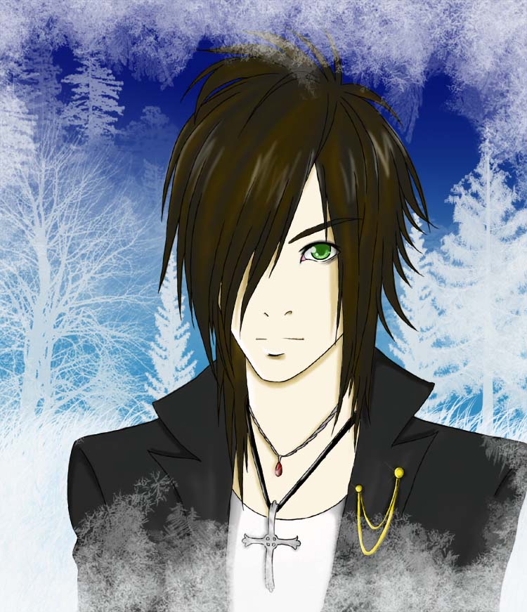
Vampire Crocell by @Ruu-chan (Aurora Collins)

I am finally finished with this. I don't think I ever had this much trouble with a piece of art before. It became so brutal for me to even finish this and a lot of times I wanted to toss it and call it quits. At first I tried color pencil but than I spilt coffee on it and got frustrated. I didn't want to get back to coloring it from square one again and that is about the time I discovered digital art. I thought that I wasn't good enough to do this particular piece in photoshop at the time and it just went in the back burner for a bit. It went unnoticed and somewhat forgotten by me.

After much pressure from my roomate I dug out the original copy a scanned it in, colored it and the BG was the hardest for me because I had several ideas for it. But I decided winter would be good since it represents death, and well since Crocell is a vampire... well you get the idea. I was going to add snow but I thought that would be too much so I left it out. I just hope you guys like it a lot because I fought with this thing so hard. Thank you all.

Note: I did look at some J-rock artists for the hair, etc.
Category:
Rating:
Everyone
Class:
Finished Work
Submitted:
15y231d ago
Tags:
None
Other Work By @Ruu-chan

Comments & Critiques (5)

Preferred comment/critique type for this content: Any Kind

Average Rating:
(5)

Posted: Saturday, 04 April, 2009 @ 05:33 AM

I like this. Despite what you say about your digital side, I think the coloring is well done. I especially like how you colored his eye and hair. You did a great job drawing his hair. I do see the J-rock influence, but it works well with the character. Nice job!

Posted: Saturday, 04 April, 2009 @ 11:57 AM

[quote="jfong"]I like this. Despite what you say about your digital side, I think the coloring is well done. I especially like how you colored his eye and hair. You did a great job drawing his hair. I do see the J-rock influence, but it works well with the character. Nice job![/quote]

Yes the hair was the biggest part with 6 different layers to it! Almost killed me! X.x But thank you so much for letting me know what you think of it. ^^

Posted: Saturday, 04 April, 2009 @ 09:29 AM

I agree with J. Fong, really nice work here. The shading is sharp, simple, but very effective, and the hair in particular has a really nice flow to it. The shine on the jewelry is nicely portrayed and I love the corner of the eye. It's such a small detail that adds so much realism to this piece. The snowy texture overlapping the top of his hair is slightly distracting, but otherwise really nicely done. The background gives it a great mood. I know how it is getting frustrated with one's own work, kudos to you for sticking with it.

Posted: Saturday, 04 April, 2009 @ 11:56 AM

[quote="Jinx"]I agree with J. Fong, really nice work here. The shading is sharp, simple, but very effective, and the hair in particular has a really nice flow to it. The shine on the jewelry is nicely portrayed and I love the corner of the eye. It's such a small detail that adds so much realism to this piece. The snowy texture overlapping the top of his hair is slightly distracting, but otherwise really nicely done. The background gives it a great mood. I know how it is getting frustrated with one's own work, kudos to you for sticking with it.[/quote]

With the snowy texture overlapping his hair, well it was suppose to be a frost frame I put in there ^^; I was hoping it would give a chilled look but the frost didn't show up on the sides of the pic because of how white the BG is. But thank you so much for letting me know what you think. Maybe I can edit it and make it even better! ^^

Posted: Monday, 06 April, 2009 @ 10:02 AM
Rating: 5

Pats on the back, I'm glad to see that you didn't give up on it. :) The snowy effect looks great, and I like how you did with his hair. Excelent job! ^__~

Leave a Comment

You must be logged in and have an Active account to leave a comment.
Please, login or sign up for an account.

What kind of comments is Ruu-chan seeking for this piece?

  • Any Kind - Self-explanatory.
  • Casual Comments - Comments of a more social nature.
  • Light Critique - Comments containing constructive suggestions about this work.
  • Heavy Critique - A serious analysis of this work, with emphasis on identifying potential problem areas, good use of technique and skill, and suggestions for potentially improving the work.
Please keep in mind, critiques may highlight both positive and negative aspects of this work, but the main goal is to constructively help the artist to improve in their skills and execution. Be kind, considerate, and polite.