XD Yeah, the white spaces should go. One part of me actually likes the "border" effect, though. XD And my airbrush is really annoying. I can't delete just one stroke; if I delete one, I have to delete them all and start over.
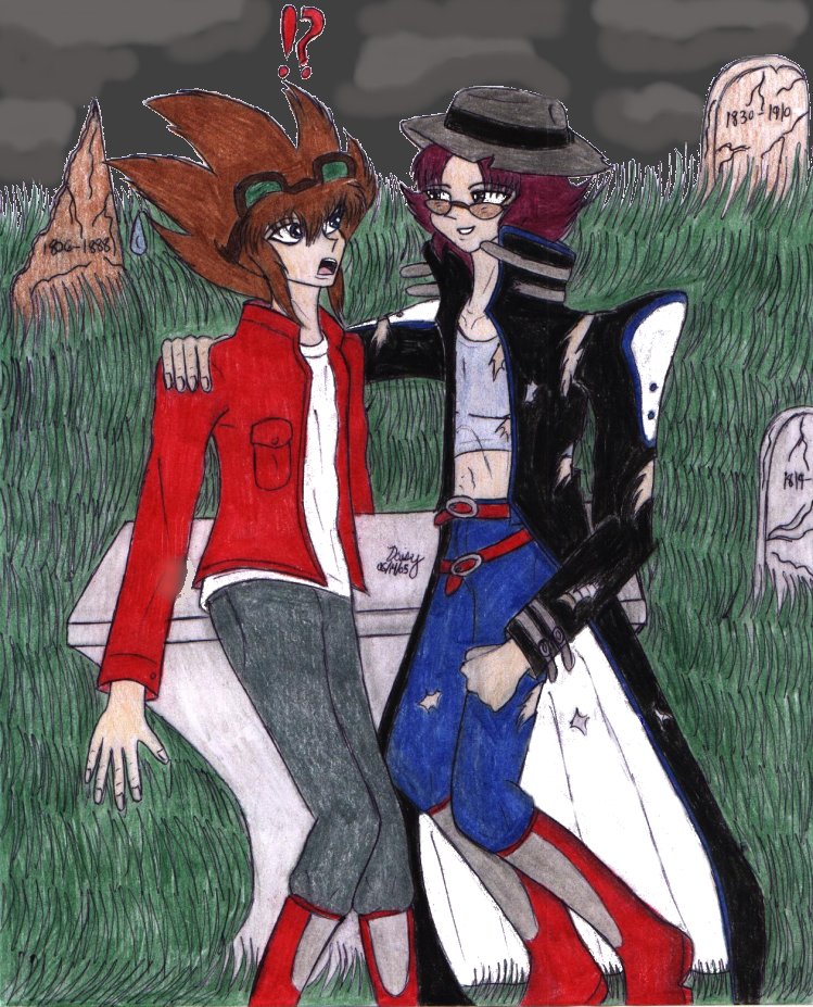
You're right about Alister's face. XD; Whoops. often does the "cherub" thing and has to fix it. And that's actually part of a bandage, not a watch. XD; He got wounded pretty bad in the accident that caused Valon to think he was dead. nod.
Ah, the jagged tombstone... Based on a tombstone in the city cemetery that creeped me out as a kid. XD; Now I just have a fascination with it, and with cemeteries in general (though I've always had a love/hate relationship with them..).


WOW. The colors are really vibrant on this one! ^_^ Looks realy good. Although, if you're gonna do comp backgrounds, you really should work on getting rid of those white spaces. XD;; I know it takes a lot of patience, but the results are rewarding. Even if you accidentally go over something, in the end, everything seems to blend better. ^^ Also watch out for when making things white, speckles show up more than you might think. XD;
I LOVE THAT HAT! It's just too kewl. XD now sees Alister in a smokey bar playing a harmonica with it on. The sunglasses turned out really great as well. Although Alister's face . . . looks a bit cheeky, almost like a cherib. XP Probably simply cutting off some of that roundness below his glasses could solve that. Still pretty dang cute though.
Valon's hair turned out a lot better this time, and his jacket is pretty squared off. ^^ I'm particularly fond of the jagged tombstone as well . . .
And what's that under the missing piece of Alister's coat on his arm, a watch?