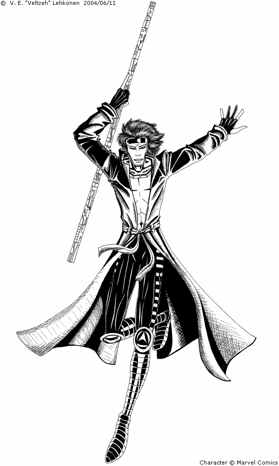
Thank you! That's a very nice comment... I thought I'd never get any anymore. =) I still have problems with poses, especially difficulties with creating depth... poses with perspective = ouch. The hair thing is a style thing... I draw LOTS of hair, hehe. The coloured version has a background, and it's coming up tomorrow. Not a good background though, but anyway.

X-Men: Gambit by @veltzeh (V. E. Lehkonen)
Well, my older picture of Gambit was getting complaints, so I drew a new one!
...With the result of reducing the amount of comments from few to none. Comment, damnit! I know there are things wrong with it, point it out!
Category:
Rating:
Everyone
Class:
Finished Work
Submitted:
20y139d ago
Tags:
None


Nice inking, as always. You capture the American comic book style very well in your shading while keeping the style all your own. If you're looking for critiques, the pose is a little awkward. You have a nice dynamic pose going on with his legs - though his right foot is a little awkward - but his upper body looks a bit stiff and lifeless against that. With the pose of his legs, I could see his upper body bent forward slightly, with his left arm maybe going down at the same angle that it's going up now. Also, I think he has too much hair, but that could be a style thing. In any case, nice work. I'd like to see a background on this image.