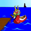
Yeah, the lack of highlights save for the hair was intentional in this one. It actually seems a little more realistic this way, as not most objects about a person (or furry, as it were), certainly not in this guy's case, would reflect light so much. Truth be told, I added highlights to the previous picture because it looked a little empty without something more, but this one is a little busier in the way of patterns and colors and such.
Hmm, interesting idea for backgrounds. I couldn't do that with the existing picture, given that I scanned these small (what's shown is only 50% of the full scanned image), but a separate head shot with maybe some interesting border effects... may have to try that one out. Thanks for the suggestion.
And thanks for the comment!


AWESOME! You draw really great action poses. I'm glad to see that brown worked out so well for his hair color--it really emphasizes his eyes nicely. Great job on the cel-shading, though there are not as many highlights as in your last piece.
As for backgrounds for this and the other one, I have an idea... You ever see the anime pics where they have the character's full body, like this, and then in the background a close up of their face, or profile? I think that if you zoomed in on his face and torso, elongated it a little, and then made it lighter by increasing the brightness, that might make a really cool background--kind of like a trading card image. Y'know what I mean? Maybe, maybe not... but I hope so!