cool it nice

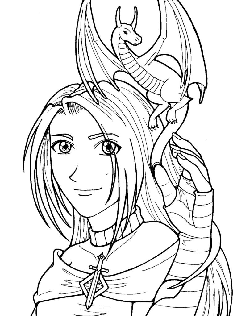
Dragon Girl Lineart by @aeryaval (Aeryn Avalon)
Just a bit o'lineart I did the other day...I was experimenting with various line thicknesses, and I quite like the way it came out. I've been getting back into the anime thing lately, and it came back easier than I thought it would. what do I like about this? Her hand. What do I NOT like? The fact that she almost looks like a guy, and I totally hadn't intended that. If I HAD, I would have just made it a guy, but noooooo....
So anyway...planning on computer coloring this eventually, once I get some spare time. The finished, colored version will be on sale at Tekkoshocon 2005!
Comments & Critiques (5)
Preferred comment/critique type for this content: Any Kind
I'm totally going to color this if you don't. Maybe even if you will, I'll color another version anyways--I still think you need to come to my house to play with Photoshop 7. The things we could do with that and pics like this...
Anyways, yeah, she does look guy-ish, but not to the point where she'd make a good guy. She seems tomboyish to me, and I think that's cool--it makes her seem like a good fantasy heroine, someone that almost everyone can identify with. Her clear expression shows a pure heart, but her outfit and the fact that she has a baby dragon show courage and determination!
The lineart is pretty snazy--it's not quite anime-style, it's like a mix between that and American comics, and I'm quite impressed by it. My favorite part is her eyes--you did the lineart on them perfectly--and her hand is very well done!
My one issue is her nose. You should check out some more anime-style noses for reference, when you try to simplify to anime style from the realism you're used to doing, you tend to OVER-simplify, and the nose becomes a simple angle, which just looks slightly off compared to the detail in everything else. Someday I'll catch you with a sketchbook and show you what I mean.
This comment is way too long. Enjoy!
I love long comments, so never feel bad about leaving me a novel ^_^
I agree that her nose is wonky. they're always the wrong shape, or the wrong size, or in the wrong place...or something. Anyway, I can never get it right...you'll have to show me what I'm doing wrong. I'm probably going to end up coloring this, but I think you should too, 'cause yours will probably come out better ;p
I like it a lot! I really don't think it looks like a guy though and I also really like the hand. Jill is right though to make her look better exaggerated eyelashes help. I was also told at one time that the distance of eyebrows from the eyes appearently make a difference but I can't draw a guy to save my life so I'm probably not the expert on this. ^_^


O.O I thought it was a guy...If you make the chin a bit smaller and add more eyelashes it should look as intented...just a suggestion...
Well anyways I love the lineart, it looks awesome. I cant wait to see it colored^^