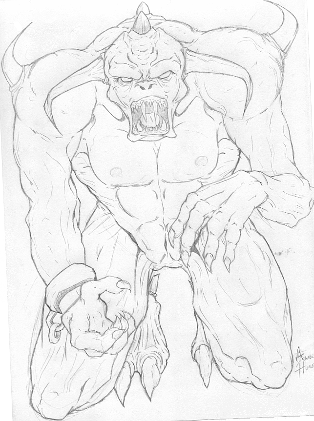
Not Anymore by @Amborg (Amber Humes)
I don't like the legs.
I had originally drawn this for someone, but now I don't know if that's where I want it to go.
@Amborg
Amber Humes

I don't like the legs.
I had originally drawn this for someone, but now I don't know if that's where I want it to go.
Wow, this is very good. It kind of reminds me of a balrog. I think the antomy came out very well and the pose looks good. The only problem I see with the legs is that one is much longer than the other. I think if you just shortened the one on the left, it would look a lot better. I also think the the arm on the right (the upper part) should be a bit thicker and that the forearm/elbow place should be moved up and to the left a little bit (thus shortening the upper arm part. I think you did an excellent job on the hands. They look really good.