Alex and Her Vespa - Final by @JesterAG (Al Gonzalez)
Finally, this one is done. Work can really kick your butt sometimes.
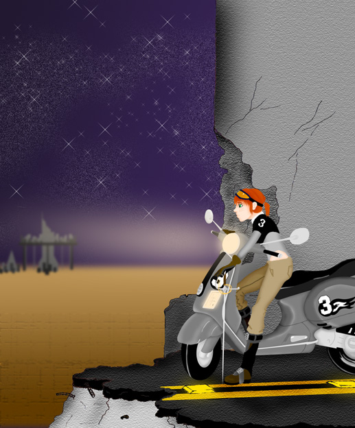
Anyhoo, this is the end product of those other Alexandrie/Vespa sketches. This thing is 100% colored in Photoshop. Alex and the Vespa are my first crack at not using my multiliner before coloring on the PC and I think I didn't do too bad for my first attempt. The only thing I regret about this one is that I did not color on a bigger version of the artwork, so all of the fine details I worked on when zoomed in get lost in the image.
Oh well. C'este la vie, live and learn.
Comments & Critiques (3)
Preferred comment/critique type for this content: Any Kind
I'm terribly sorry I haven't gotten around to commenting on your gallery yet, Crono. There's really no excuse except for undefiable and ungodly laziness. ^^;;
This is really an awesome piece of work, you've come so far since all the Legends images I remember seeing.
I see familiar textures, but you make good use of them, and the coloring is well done as well. The Vespa especially is very impressive; very authentic looking shading, though the front wheel looks a little flat somehow. I'm not really sure why. The cracks in the wall are a nice touch. Well combined elements, very nice stuff. ^_^


Your hard work paid off in this image! The Vespa especially looks amazing--it really looks 3D! Alex has good dimension to her coloring as well, though not to the same degree as the Vespa... I think her head, left arm, and right leg are the best parts of her...
I LOVE the starry sky in the background... That's just... wow. Must be nice to be somewhere where lights don't obscure that sight. Nice texture use, too, especially the size change on the background... ground! That was a really neat effect! The light shining from the headlight of the Vespa, though, seems like it might be a little too bright... Maybe...? And it looks like it's going horizontally instead of at the angle that the light (and the front of the Vespa) is facing. You've got a really good grasp at making a background, though!
Definitely one of my favorite images from you! I'll be awaiting the next one! Poor little lost details...