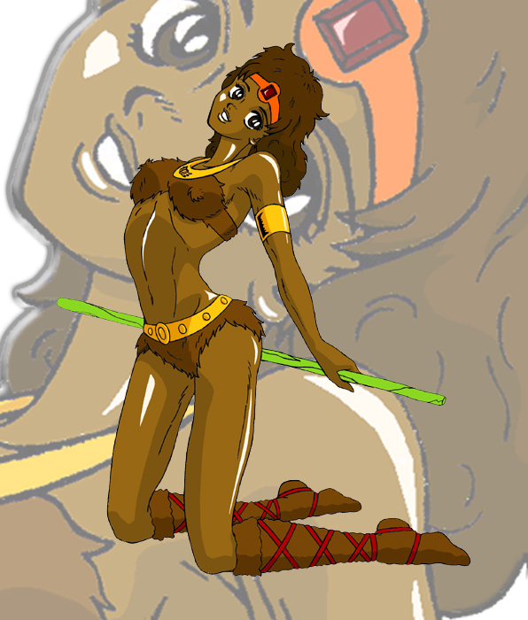
Nice picture, but I don't think the background version of it works as well. The lineart especially looks really nice on the full-size one, but it looks blocky and over-enlarged in the background. It's kinda distracting; maybe have it still in the background but not quite so large?
ANyway, nice piece.
Wolverine.


Nice work!