Thank you for the honest critique, I appreciate it.
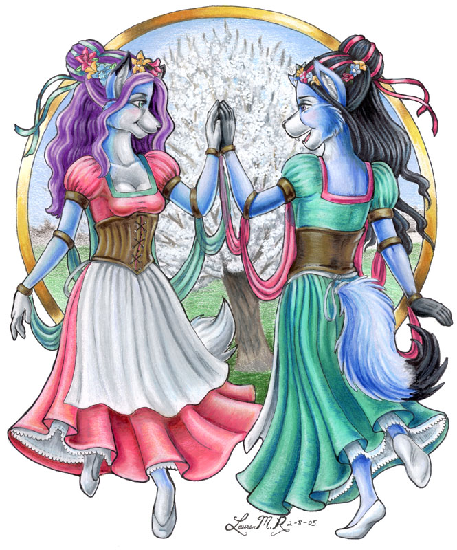
I suppose I know what you mean about their cheeks now. It was only after I consulted my boyfriend on the way they look that I got some more honest feedback. They were supposed to be wolves, and he's like..."Uh, no, they look rodent-like...their ears need to be more slung back, and their cheeks are too pouchy." me: "........?!?!??!?!" NUCLEAR MUSHROOM CLOUD hehe, I guess I still need a ton more practice with those kinds of forms. As for her chest, I know what you mean---it was a flaw even I could see, but one I didn't realize was there until after I inked it. The left breast needs to be moved over towards the arm more; they're too close together. I have a bad habit of doing that as far as female chests go.
Anyway, thanks for the comment!


Impressive . . . good shading, good effects on the tree, excellent portrayal of motion through pose and the position of the ribbons . . .in fact, there are only two critiques I can offer for this. 1. Their cheeks look a bit pouchy. Not the best way to describe what I'm trying to say, but I think you know what I mean. I think their snouts look fine. 2. The leftmost dancer's chest looks a little . . . off. I'm not sure how, exactly, but it doesn't look /quite/ right. All in all, though, a very good job. Keep it up!