@Farel
Jan Nowak

SevenPack Page 5
SevenPack Page 5 by @Farel (Jan Nowak)

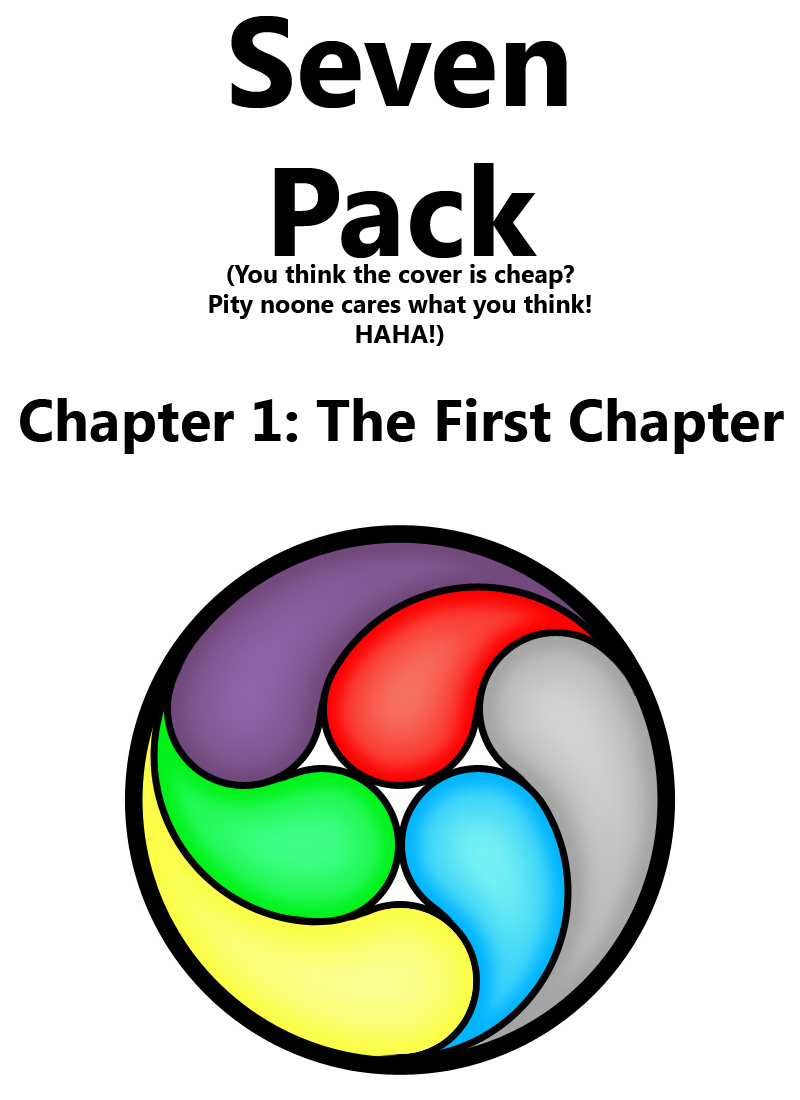
Hmmm well this is the logo/cover. Why is the first chapter's title "The First Chapter"? Cause I didn't come up with any better title!

.... you like the logo?

Category:
Rating:
Everyone
Class:
Finished Work
Submitted:
15y292d ago
Tags:
None
Other Work By @Farel

Comments & Critiques (2)

Preferred comment/critique type for this content: Any Kind

Average Rating:
(3)

Posted: Monday, 02 February, 2009 @ 12:57 AM
Rating: 3

I like the sense of movement in this logo and I think the color choices work very well together. I would like to think that each color has some form of specific meaning. The blue seems to have a light disconnection between the inner and blue and the darker border. I don't know if that is intentional or not. I really like the way that the highlight and shadow is handled in the grey section of the logo it gives it almost a three dimensional feel to it.

Posted: Wednesday, 04 February, 2009 @ 09:06 AM
Wow thanks : )

Actually each color represents one of the 6 characters.. I'd wish I could make it even more symbolic somehow

Leave a Comment

You must be logged in and have an Active account to leave a comment.
Please, login or sign up for an account.

What kind of comments is Farel seeking for this piece?

  • Any Kind - Self-explanatory.
  • Casual Comments - Comments of a more social nature.
  • Light Critique - Comments containing constructive suggestions about this work.
  • Heavy Critique - A serious analysis of this work, with emphasis on identifying potential problem areas, good use of technique and skill, and suggestions for potentially improving the work.
Please keep in mind, critiques may highlight both positive and negative aspects of this work, but the main goal is to constructively help the artist to improve in their skills and execution. Be kind, considerate, and polite.