@migucast
Miguel Castaneda

The Ending that Should've Been
The Ending that Should've Been by @migucast (Miguel Castaneda)

Metroid Prime Spoiler, don't click or proceed reading this if you don't want to be spoiled!

. . . . . . .

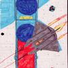
Okay. As much as I loved Metroid Prime to death... Alas... Perhaps due to time constraints and such... It stood up a Metroid TRADITION! Samus... Did not take off her armor in the best ending. Only, her helmet. :\ And to make matters worse... Her realistic look is... Actually... Quite unappealing. :\ So, here's what the ending SHOULD'VE looked like! The same general pose, but, sans armor, and with Samus' design from Super Metroid (sorry, still can't afford Fusion yet so I haven't seen its ending yet).

Category:
Rating:
Everyone
Class:
Finished Work
Submitted:
21y262d ago
Tags:
None
Other Work By @migucast

Comments & Critiques (2)

Preferred comment/critique type for this content: Any Kind

Posted: Thursday, 06 March, 2003 @ 12:03 PM

Her outfit is so cool! She's very cute. I like her pose too.

http://www.side7.com/art/liliwagn/gallery.html

Posted: Friday, 07 March, 2003 @ 03:21 AM

Thanks! ^^

Leave a Comment

You must be logged in and have an Active account to leave a comment.
Please, login or sign up for an account.

What kind of comments is migucast seeking for this piece?

  • Any Kind - Self-explanatory.
  • Casual Comments - Comments of a more social nature.
  • Light Critique - Comments containing constructive suggestions about this work.
  • Heavy Critique - A serious analysis of this work, with emphasis on identifying potential problem areas, good use of technique and skill, and suggestions for potentially improving the work.
Please keep in mind, critiques may highlight both positive and negative aspects of this work, but the main goal is to constructively help the artist to improve in their skills and execution. Be kind, considerate, and polite.