@PhyreLuck
Jennifer C

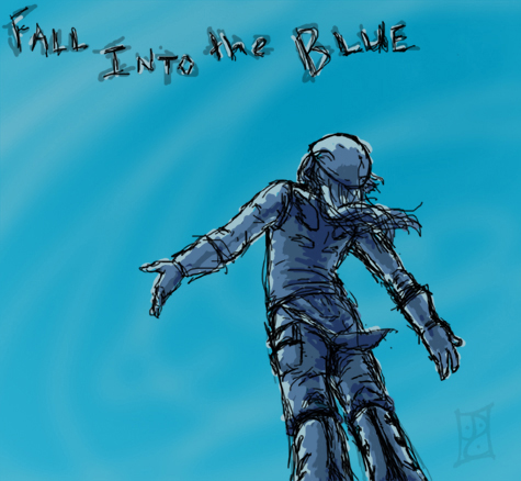
Fall into the Blue.
Fall into the Blue. by @PhyreLuck (Jennifer C)

The second of two Photoshop sketches this weekend. While the other one took all of ten minutes, I spent a little more time here trying to get the pose right. (This perspective is a real pain :P) I also did the skeletal lines on a different layer and cut them out at the end. Makes it a bit cleaner. I just kinda winged it on the shading.
Practice makes perfect, right?

Media: Photoshop 5.0, mouse.

Category:
Rating:
Everyone
Class:
Rough / Concept
Submitted:
19y155d ago
Tags:
None
Other Work By @PhyreLuck

Comments & Critiques (1)

Preferred comment/critique type for this content: Any Kind

Posted: Monday, 20 June, 2005 @ 01:52 PM

i like that angle, and the sloppy shading/coloring.. lol.. I have tried coloring like that, but failed so many times.. i don't know why I'm drawn to that sort of roughness. anyways, its very good.

Leave a Comment

You must be logged in and have an Active account to leave a comment.
Please, login or sign up for an account.

What kind of comments is PhyreLuck seeking for this piece?

  • Any Kind - Self-explanatory.
  • Casual Comments - Comments of a more social nature.
  • Light Critique - Comments containing constructive suggestions about this work.
  • Heavy Critique - A serious analysis of this work, with emphasis on identifying potential problem areas, good use of technique and skill, and suggestions for potentially improving the work.
Please keep in mind, critiques may highlight both positive and negative aspects of this work, but the main goal is to constructively help the artist to improve in their skills and execution. Be kind, considerate, and polite.