@ajfox
A Girtz

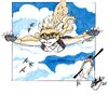
Caliber (Star Trek Fan art)
Caliber (Star Trek Fan art) by @ajfox (A Girtz)

It would seem the heaviest of the month's demands are nearing an end.  Soon I'll be able to shift more focus back to art on a more consistent bases. 

As promised, my follow up to an older image I uploaded recently from 5 years ago, featuring a crafty vixen commander and her first assignment.  Things have come full circle with this piece featuring most all of her crew and the ship she captians. (Miranda Class USS Caliber)  For a fan story I thought up at the time. Thinking about it now, makes me wonder if I'll ever get around to drawing or writing it out.

For the Trek geeks; yes, the registry numbers are borrowed/not correct to the ships, though they should be period-accurate for the motion picture era.  The same goes for some of the characters and uniforms, as the story brings random individuals from various time periods together to defeat a very powerful enemy. Set around the time of the Undiscovered Country (ST:6 - 1991)

Fan characters © A. Girtz

Star Trek - IP © Gene Roddenberry & Paramount

"Only in the darkness can you see the stars"   -MLK Jr.


Comments & Critiques (2)

Preferred comment/critique type for this content: Any Kind

Average Rating:
(5)

Posted: Monday, 21 October, 2024 @ 05:36 PM
Rating: 5

Awesome! More trek art!

I simply LOVE character collage works cause it shows TRUE dedication to wanting to make one's art really stand out.  It takes a LOT of patience and skill to pull off a proper collage cause there is things to consider like background, character bust size, positioning, orientation, and perspective  This is a LOT of brain matter to come up with and even more tenacity to bring to fruition.  Movie posters are particularily my fave cause of in comparison to say a painting or framed drawing, they seem to come alive and you can sense the epic scale of what the movie being portrayed through the picture conveys to the viewer.  


Edited 3 times.
Posted: Monday, 21 October, 2024 @ 07:50 PM

@XxTheCreativeKitsunexX:  Well said and exactly right!  I had to also be really careful with coloring, as is usually the case with works like these.  (dark uniforms and other details against a black background,  contemplating the correct skin/fur tones and clothing colors, so as to try and maintain variety & balance, etc.) 

I consider this work my first successful attempt at a galaxy (albeit on a small scale) blended with space.  Copic markers are blend-oriented and I need to spend more time on really developing that aspect for future works, as this piece had shown.


Edited 2 times.

Leave a Comment

You must be logged in and have an Active account to leave a comment.
Please, login or sign up for an account.

What kind of comments is ajfox seeking for this piece?

  • Any Kind - Self-explanatory.
  • Casual Comments - Comments of a more social nature.
  • Light Critique - Comments containing constructive suggestions about this work.
  • Heavy Critique - A serious analysis of this work, with emphasis on identifying potential problem areas, good use of technique and skill, and suggestions for potentially improving the work.
Please keep in mind, critiques may highlight both positive and negative aspects of this work, but the main goal is to constructively help the artist to improve in their skills and execution. Be kind, considerate, and polite.