My real name is Nicolette..and I just can't tell you how much I despise that name. ;)
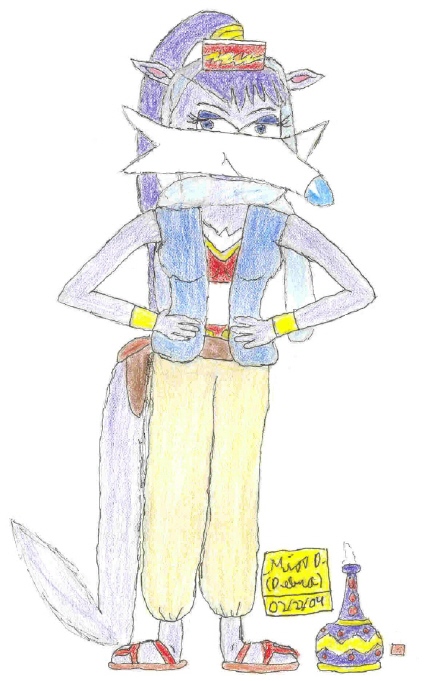
Now for the critique! She's extremely flat looking here, and I'm not talking about the bust. Now, I realize that Sonic the Hedgehog isn't the most realistic looking game in the world, but you should do some research on bodily proportions of both humans and whatever animal she is, combining them to create a more "believable" creature. Try experimenting with different values and shading to give her depth and more of a shape.
I'm not trying to be mean- this is a critique, meaning I'm hoping for you to improve in your artwork and giving a few tips. Good luck! =)


Kewlness! This is great. ^__^ The ears should be bigger, but other than that it looks fine X3