This picture was... a reeeeeeeeally long time coming... ^^;;;; I drew this back in 2001 or 2002 for Red Leader's birthday, and it's been just SITTING in my poor sketchbook, waiting to be scanned and CGed... I think that was back when our monitors were screwed up, and then we couldn't scan stuff... But anyways, the picture still wasn't completed... I tried drawing a new picture for Red's birthday last year (Felicia from Darkstalkers), but it came out crappily... So I decided, why not just finish coloring poor Peach here and give that to him for his 2003 birthday? Of course, I still owe him another picture for this year's birthday... ^^;;;;; I'm so so behiiiiiiiiiiiiind!!! ;_;
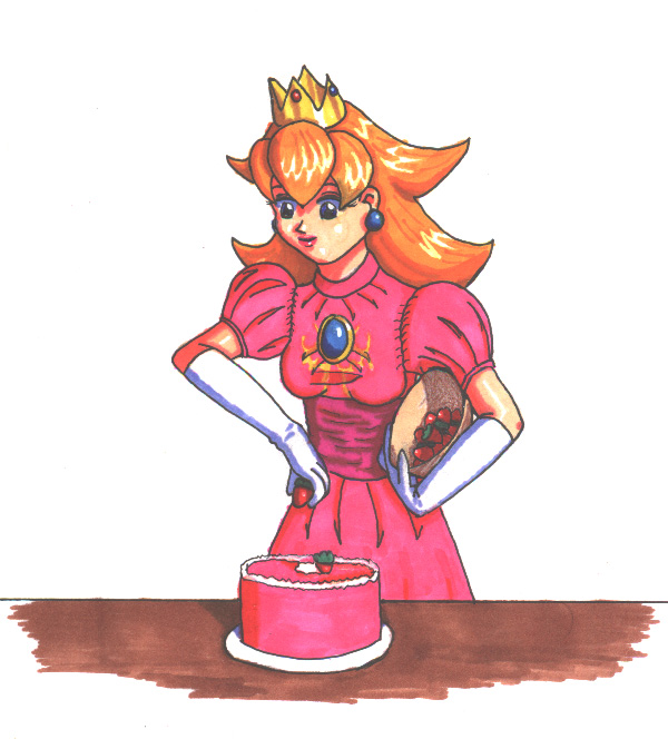
Anyways... this is Peach from... a whole lot of Nintendo games, decorating a birthday cake! The cake idea came from Mario Party 1 (I loooove the Mario Party games!), where Peach's stage is a big birthday cake that you sort of "decorate" with Pirahna strawberries... This cake isn't as big or elaborate as the one in the game, though. I used her Super Smash Bros: Melee design for this picture, and drew it using her first SMASH trophy for reference...
Being the perfectionistic artist that I am, I knew that CGing this picture would take a long time (especially since I have two more pictures in the middle of being CGed that I haven't touched in mooooonths... ^^;;), so I decided to just go ahead and color it with my Prismacolor markers, with a white Prismacolor pencil to try to correct mistakes. And I finally followed Li-chan's advice and tried a Uniball white gel pen to touch up the highlights.
I'm pretty pleased with the coloring, though I made the highlights in her bangs too low (I tried to extend the spikes higher with the gel pen to fix it a tad... ^^;;) and I don't like the metallic effect on her crown... Drawing-wise, I hate the hand holding the strawberry... ^^;; But besides that stuff, I think it came out pretty spiffily (that's probably not a word... ^^;;) and bright and colorful... This is of course the no-text version (Red's version has a birthday message)...
So yeah, enough of my babble... ^^;;;; Happy veeeeeeery late birthday, schweetie-pooooooo! ^-^


Very pretty, Nadia! Though I could wish it had a background too. But, it's very brightly colored, and definitely true to the original design. And personally, I think the highlights and the shading overall look pretty good, and the metallic appearance of the crown doesn't look fine.
I think what stands out most to me here is her right arm (HER right, holding the strawberry). It looks like a really weird bend, kind of back in towards herself instead of toward the cake. This may be in part because of the shading, but I really think it's because it looks like it should be lower and that more of the front of her hand should be showing. The other thing I really notice so far as the drawing itself goes is that the cake looks a little lopsided if you compare the curvature of the part touching the plate to the curve of the top. This is really minor though, and it might just be my eyes playing tricks for that matter, but it doesn't look even to me.
I really see no problems with your coloring or anything else here; I envy your ability with markers.
Draw/CG/post mooooooooore. :D