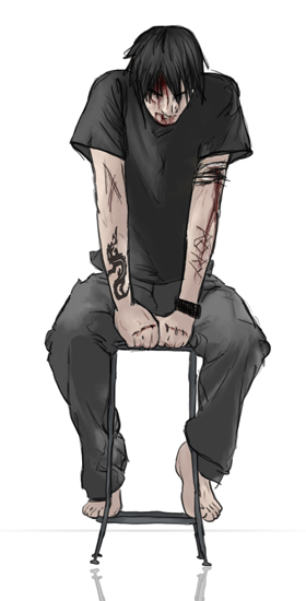
At The Edge of the Dark by @AfterDarkAngel (Dark Angel)
WORK IN PROGRESS
Sketched and Coloured 100 percent in Photoshop. It looks all right just as is, but I not happy with it just yet. I think I’ll add a bit more and a layout. Its at around 50% of original size.
I don’t like his hands that much and they look blah and there are a few other things that I think could be better.
Equipment/material: Acecad Flair Tablet, Photoshop 7 Reference: Rip Curl Ad


i disagree. i think the hands are very life-like, and your shading is too. no over-shading for you! ^^ and you draw stances/positions very well. i love it, and he's pretty hot!! ^_^