The way you did the wrinkles really catches my eye. great job on those.. the hair looks slightly less defined then the rest of the piccy.. but you proly ment for that :)

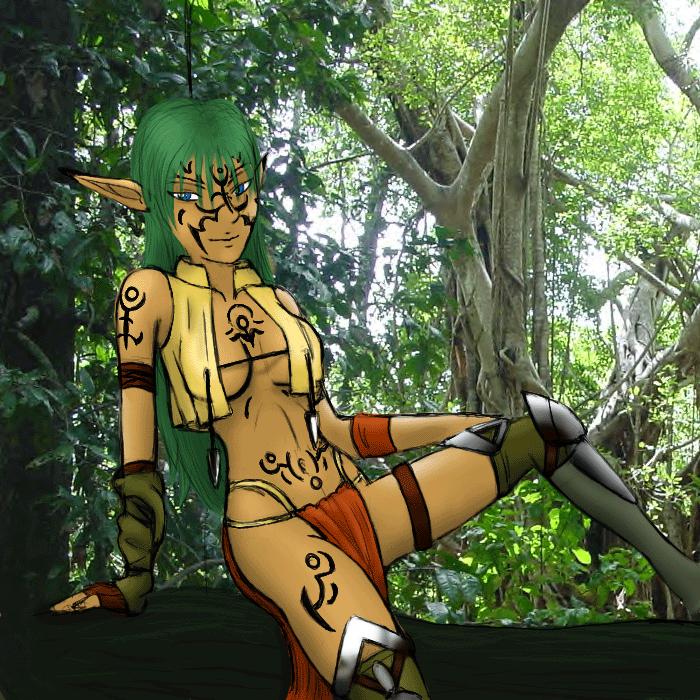
Wood elf by @WaterGoddessMillenia (Millenia Syke)
My version of a wood/jungle elf. I think I need to work on putting more clothes on my characters but that will take time lol. I really like this drawing because I usually don't put in backgrounds cuz im not very good at them..but in this pic it actually came out ok ^^.
Comments & Critiques (7)
Preferred comment/critique type for this content: Any Kind
Very nice! I'm really liking the design you have for this character. You did an excellent job on anatomy and shading--she looks quite textured and 3D, and she interacts extremely well with the background. I really love her costume design.
The tatoos all over her really add a tribal feel to this, as the pointy arrowheads? hanging down from her shirt. These details are really excellent touches and really add to this image.
Her eyes bother me, though--I think because, in contrast to the rest of the image, the whites are pure white. And there is no pure white anywhere in the rest of the image. I think using pure white is okay for the eye highlights, but I would avoid it for the actual whites of the eyes. Try adding a little, tiny bit of gray shading around the edges of the upper lid--I think it really makes the eyes stand out.
And there is a strange black line coming from the top of her head--I thought it was part of the photograph at first, but it doesn't fit. It's strange.
Overall, I'm quite impressed. It's nice to see an image that really works with a photo background!
looks pretty nice hehe though the eyes seem a little uneven or something about the face seems off that I cant place for some reason ah anyways the rest of the anatomy is well done and it seems the coloring goes really well with the bg pic ah I will stop my rambleing and run on sentence for now and let you ketch your breath
Most of your work seems to fall under the category of 'pin-ups.' claps I aprove...
This one particularly looks pretty cool. The background really does add a lot. And (with a slight exception for the absolute horizontalness of the branch she's sitting on) it flows well with the part thats hand drawn. Very nice.


oh! this is so cool! that's an awesome backround, i wish I had places that lovely near me.. Very awesome!