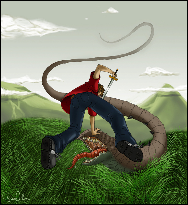
Wow! That is a really good drawing, the detail of the grass is fantastic, the pose of the kid is awesome. You did a wonderful job on it! ^__~

TiSRestriction by @tisbore (Ryan Culver)
a modern kid, taking on some monster. I'm not happy with the grass or the cheap background. I may end up redoing it, so any ideas/crits would be lovely. thank you.
a pic of the kid, pinned against another mob - http://tisbore.deviantart.com/art/TiSOverwhelmed-25913876
Comments & Critiques (3)
Preferred comment/critique type for this content: Any Kind
Kudos on the pose; that's a really weird angle and very awkward to draw, but you did it well. ^^ I like the bg myself, especially the mistyness and how the monster's tail fades into it. If you have a problem with the grass, I'd suggest making the colors a little less bright; use more neutral greens and a few dull yellows and throw in some browns instead of the blacks, and it'll make it look a bit more natural. Making the hills a little darker and duller might make the bg look a little less cartoony, too; them maybe you can be as happy with it as I am with the way it is now. Oh yeah, and the detail in the monster's mouth is great. Yucky. ^^;


Wonderful angle, very dynamic picture. I think you have the right idea for the grass, just use shorter strokes on the hills to make it seem smaller and thus a little further away and angle the strokes up a bit to make it seem less like it's all flattened. I like the simplicity of the background, it emphasizes the foreground that much better, and the lighting's portrayed nicely, as well.