@Yukinite
Chenoa D

Faery
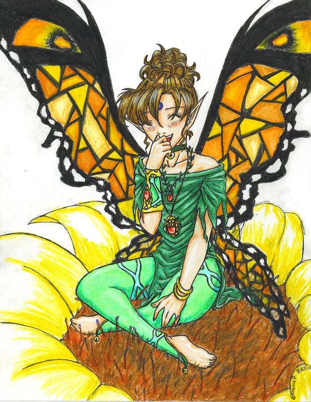
Faery by @Yukinite (Chenoa D)

I drew this as a request from someone on one of the other fanart sites. I did kind of a slack job. I was in a rush to finish it so needless to say I'm not that happy with it. But I hope you all like it none the less. I could have done better on the coloring if I hadn't been rushed. Anyways, have fun in my galllery!

Category:
Rating:
Everyone
Class:
Work-In-Progress
Submitted:
20y313d ago
Tags:
None
Other Work By @Yukinite

Comments & Critiques (3)

Preferred comment/critique type for this content: Any Kind

Posted: Tuesday, 13 January, 2004 @ 10:11 PM

Your lineart and design are excellent, you've got anatomy down pretty darned well, and the character herself seems to be well colored. The only flaw is the one you yourself mentioned--that you were rushed and didn't take time to finish the coloring. Well, you know, it still looks good but could definetly be better, if the lovely shading-highlighting you did on her hair and shirt are any indication of your coloring skills.

Her legs don't look quite right, though. I think they need some more lines, for example, outlining the kneecap, to show what's going on in them more. I'm guessing you draw faces and torsos more than legs, since the face and torso here are incredibly well drawn. Keep working on lower anatomy, though, you'll get it in no time at all.

I love the details in this image--from her jewelry to the transparency of her lower wings. I just wish there was more of a background so you could show off the transparency of the wings more in the upper half. My only other critique? It's quite silly, really, but I don't like the blue thing on her forehead. The blue just doesn't seem to match her green color scheme.

I'm definetly impressed by your work and will be adding you to my museum, for sure!

Posted: Tuesday, 13 January, 2004 @ 11:20 PM

The anatomy and expression are really good - not much to improve there, if you ask me! Her hair is really well-drawn, too - I like the way you coloured it.

A good thing to try is to use more colours when shading - don't just use darker green to shade a green object! For example, she's sitting on a brown flower-middle, so some of that reddish colour should reflect on her pants, the petals, and so on. Using other colours in the shadows can do wonders for the depth of the drawing! (blatant plug: a colour tutorial I wrote: http://www.idenise.net/misc/art/colourtut/))

I really like her costume - like Li-Chan, I think the blue thing rather clashes with her green/red outfit, but that's quite minor. Her wings look like stained glass...that's another thing I like!

Good work, overall - I really like this picture, and I'm sure the requester will, too. :)
Posted: Wednesday, 14 January, 2004 @ 11:08 PM

Well personally I like this picture a lot. I can see that you rushed, but it still turned out very nice. I especially love her face, hair and costume. (Can I steal that arm band of her's? I'd wear it all the time... Sorry off the subject.) About that blue circle on her forehead, I think it looks just fine. I think it accents the green and it looks nice next to her brown hair and the oragne in her wings.

Nice job. ^^ I look forward to more pictures from you. ^^ Keep up the good work and try to take your time. (As my art teacher said... "If you are talented enough to pull out a master piece in fifteen minutes, take your time and be amazed at how much better it will be when you don't rush.") Oh speaking of which... I find that whenever I get tired of a picture, the best thing to do is drum roll please stop drawing it. ^^ Whenever you are ready come back and start again. At least it works for me.

Great job! ^^

Leave a Comment

You must be logged in and have an Active account to leave a comment.
Please, login or sign up for an account.

What kind of comments is Yukinite seeking for this piece?

  • Any Kind - Self-explanatory.
  • Casual Comments - Comments of a more social nature.
  • Light Critique - Comments containing constructive suggestions about this work.
  • Heavy Critique - A serious analysis of this work, with emphasis on identifying potential problem areas, good use of technique and skill, and suggestions for potentially improving the work.
Please keep in mind, critiques may highlight both positive and negative aspects of this work, but the main goal is to constructively help the artist to improve in their skills and execution. Be kind, considerate, and polite.