@Lucky_Ladybug66
Daisy Hunt

Auf Wiedersehen
Auf Wiedersehen by @Lucky_Ladybug66 (Daisy Hunt)

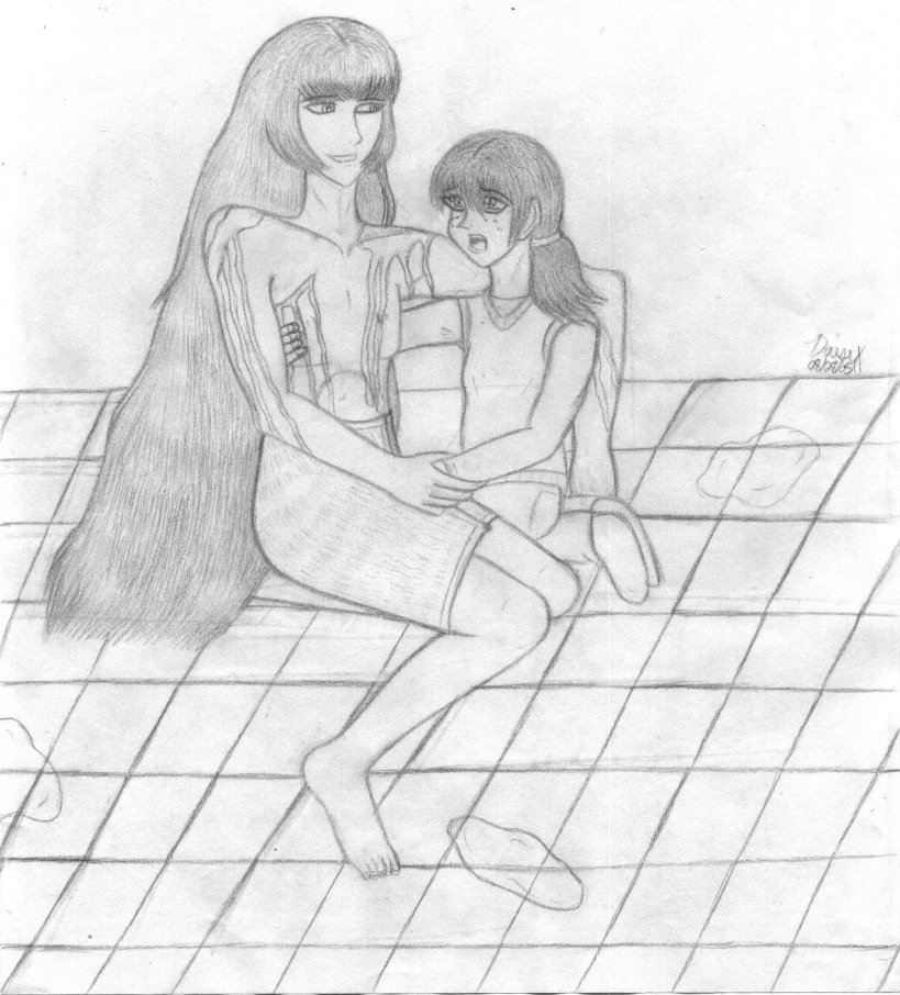
Consider it a new record? XD; Grand Prix started Saturday and I already got fascinated by the Von Schraiders and have come up with a plot for a short story involving them. This is an illustration from said fic. I figure that Siegfried's actions during the Grand Prix caused his company's reputation to fall to ruins. Perhaps his board of directors was furious at him and tried to kill him when he got home? Or rather, one of them did, because he feels that he could run the company better than Siegfried or his father. So he went to the manor and shot him up shortly after he'd gotten out of the tub. Siegfried managed to press a button that sent the guy falling down a trapdoor, where he would remain trapped until the authorities could get to him, but he was too badly injured to move very far away. Leonhard heard the shots and came to find out what happened. He's able to help Siegfried sit up and they talk for a few minutes, but Siegfried is certain that he's dying from the multiple wounds and the blood loss. He tries to comfort Leonhard before falling unconscious.

I scanned this grayscale version in because I was afraid of messing up the texture on the hair. XD; I am going to color this one, though. I really love how I did the hair..... The blood isn't darkened in because of the future coloring.

Parallelograms! I remembered Lady Amber Jo's advice. ^^ I know they're kinda odd-looking, but basically I think they turned out alright.

Category:
Rating:
Teen (VO)
Class:
Work-In-Progress
Submitted:
19y83d ago
Tags:
None
Other Work By @Lucky_Ladybug66

Comments & Critiques (3)

Preferred comment/critique type for this content: Any Kind

Posted: Tuesday, 30 August, 2005 @ 01:47 AM

KCGP art! I'm surprised to find some so soon, 'specially since the dubbed version has only started airing.

The shading and detail on the hair seems rather nice, and I assume the lack of shading elsewhere is because you plan to color it in later. As it is, the hair looks pretty good.

Siegfried's proportions seem to be very nice (his right arm - the one holding Leon's - is an especially nice hand), and his torso also looks very nice (I find it terribly difficult to draw bare-chested males). His other arm might be a bit too long though - not much, but it seems just a bit offbalance.

Seigfried does seem rather... content over the fact that he's bleeding. Almost like it's an everyday occurance. ^_^ Just part of a day's work, and all.

And that's an awesome floor, there. It really helps offset the rest of it, providing them an actual place to rest.

^_^ I hope the colored version comes out well.

Posted: Monday, 05 September, 2005 @ 09:39 PM

beats Side7 down with an ugly stick and finally gets the flippin' page to come up

LOL. Yes, most definitely a new record. Siegfried interests me, though not so much in an h/c nor fangirlish way in the least. Though angst is a strong possibility. And of course, he's a business man. Mwauh. >D

I like how the hairlines up on their heads turned out, as well as the bangs. Though for Siegfried, if you're gonna do the more realistic hair style, you should probably straight out his side bangs a bit more, or rather, make them a little less obvious. Otherwise, it makes things look just a tad awkward. And Leonhard's ponytail should probably be . . . hmmm . . . a little less full or looking like it's pulled tighter where the band is. It looks like it'd fall out the way it is. His sidebangs turned out really good though. ^^

I think Siegfried's body turned out pretty well, even the foot! still can't draw feet that well Though his left arm, the one around Leonhard, bugs me . . . I think it may be longer than his other one. And I finally figured it out. The elbow is suppose to be at about the waist and whatnot. which was the only thing she got out of the long line of criticisms from the high school art teacher ((She immediately says something negative as soon as she sees someone's work)). It also doesn't look like it's really too much against Leonhard . . . shrug Though I'd say his nose is pretty durn next to perfect.

Those were supposed to be gunshot wounds you say? Hmmm . . . The one down below his right arm certainly looks more like a knife wound to me. XD;; Perhaps in the future would should start trying to draw the wound/source of blood itself. nodnod I've started to try to do that and it does look more authentic. Though I find it easier when the person has clothes on because it's easier to hide. LOL

I'm certainly going to have to get to this fic soon. >3 ... Though as I've said, people keep interrupting my schedule. ~.~;;
Posted: Tuesday, 06 September, 2005 @ 06:14 AM

XD Yes, I know that one most certainly is no bullet wound.... The problem was, I tried doing bullet wounds and then I didn't like the way it looked. laughs. So maybe for this version, he got stabbed as well as shot. ^^;

ponders over the arm. I'm not sure whether it's longer or not. XD; tried to compare the two with various measuring techniques she uses. I never did come to a complete conclusion.

Leave a Comment

You must be logged in and have an Active account to leave a comment.
Please, login or sign up for an account.

What kind of comments is Lucky_Ladybug66 seeking for this piece?

  • Any Kind - Self-explanatory.
  • Casual Comments - Comments of a more social nature.
  • Light Critique - Comments containing constructive suggestions about this work.
  • Heavy Critique - A serious analysis of this work, with emphasis on identifying potential problem areas, good use of technique and skill, and suggestions for potentially improving the work.
Please keep in mind, critiques may highlight both positive and negative aspects of this work, but the main goal is to constructively help the artist to improve in their skills and execution. Be kind, considerate, and polite.