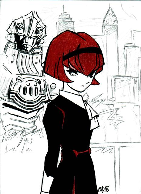
Thankyou, Im glad you liked the way it came out, I was actualy a little nervous that it didnt look to good. yeah, the buildings are pretty bland, but this was just a rough sketch for them. so they didnt turn out to well. I actualy want to color all of this, and give it a good backround...lets see if I ever do ;P

Dorothy by @Pop_a_doc (Matt Thompsonn)
Dorothy, from Big O, with Big O itself in the backround. Big O doesnt look very good, but I like how Dorothy came out.
Category:
Rating:
Everyone
Class:
Work-In-Progress
Submitted:
20y362d ago
Tags:
None
Comments & Critiques (6)
Preferred comment/critique type for this content: Any Kind


Very nice! I like her dark, gothic expression, and the bold coloring suits her very well. I love the sketchy look of the Big O in the background--you know, I haven't seen that show but once, so I can't comment too much on it, but I think it looks really good. I like the way you have the high contrast mixed with the pencil lines. But the buildings on the right side of the picture are really rather generic--they need more contrast, to match Big O on the other side. Without that, it makes the pic look slightly unbalanced, you know? Though I do not think they should have exactly as much contrast as Big O, since they are farther away... Ah, well. I love the simple colors. :)