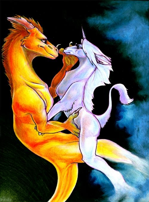
Ike continues to insist that I should have made the dragon green! But, I just love the blue/orange combination far too much. :)
It took me a while to decide what I wanted to do with the legs (they were already very erroneous to begin with - very old sketch!), and eventually it occured to me that making the ends part of the already-existing clouds that I had going in the top right corner at the time. But, a few people don't seem to like it much - maybe it is too distracting? Thank you for the helpful suggestions, hon! :D They are kept in mind for future pictures. :}


Holyjesus why doesn't this have any comments.
Heather, you amaze me with your talent. The contrast of the orange dragon aginst that black/green is just TOO visually enticing. It makes my eye just jump all over the piece, trying to take it all in at once. I don't think I like the way their feet are just.. sort of lost in the clouds, though, and I think the image would be more powerful if you had continued to define them a little more. I love the way the orange dragon is tenderly touching the white one's face, as well. It's so sweet...