
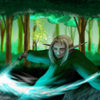
grey shading.. yes.. i think i know what you mean. but i think it might have to do with the pencil drawing that i used underneath the color. i know other things i've done [that aren't over refined pencil drawings] i have gotten the feeling that i was cheating the shading business..it seemed too easy. nothing is easy.. dammit.. >_< i haven't experimented much with the adding of different tones to make them interesting, however, but i know i have given it some thought. now that you've called attention to it, i think i'll start..working on it. but how? .. its almost like i haven't the mental capacity for it. i need a tutorial. as for that lensflare, its not. i'm anti-photoshop filter lensflare. i painted it myself, smudged it all out like that; the sun is supposed to look like its exploding. if i made this as realistic as possible, there actually would be no color to them due to the massive brightness behind them. but i cheat logic all the time..only because i dont believe in the blasted thing. the rim lighting was an inspiration..so i barely knew what i was doing. i also wished i had some kind of photo-reference for it. then i'd have a better grasp on the whole.. 3D thing. but it can't be helped ..i guess. i'm kind of anal about other people touching my art. .. but.. i really would like to learn what you're talking about. so yeah, you can do whatever to it. show me what you mean. would you like me to send you the non-compressed version for photoshop 7?

UT II: Tear Fire by @damistee (Heather Steele)
meehh.. huge description..dont feel like typing it. bleah. i'm not done yet..there's something about it i dont like at all, but i've yet to figure out what it is. suggestions would be very appreciated.
Comments & Critiques (4)
Preferred comment/critique type for this content: Any Kind
Hmm. I'm not sure, but I think the gray shadows kind of emphasize just how bright the light is in the background. Although Athena-san is very right, shadows are different colors. I have trouble with that, so I wish you lots of luck. This is really a moving image, absolutely gorgeous. Just like an image of pure... compassion. It's really amazing, amazing how you've captured pure emotion like that in this piece. Consider me impressed.
i'm pretty sure that the grey shadows are just..my grey pencil. you know? haha. but the fact still remains that i dont use color when i go shading something in photoslut. thats what i was going for. if i can't draw awesome stuff, at least i should be able to draw moving stuffs. tadda.. ^_^ ..thank you very much.
Your expressions are exquisite, and you're doing the hand anatomy really well! That said, I think one thing that's really huting this piece is the grey shading you're doing. Shadows actually come in a ton of different colors--blueish and purpley colors are usually a good place to start.
Second of all, I think the lens flare is really distracting, taking away from the otherwise really nice setup you have going here. That is, instead of being able to look at their faces and study them, My eye keeps getting torn towards this horrible eyesore which is...the Lensflare. Stay away from 'em. Paint in a lightsource. No, really! It's gonna look MUCH better, I promise.
I can also see places where your rim lighting could be pumped up some more--there's some on the angel's belly and wings, but they'd look more 3D if you used it consistently over all the figures.
If you're interested, I could do a quick paintover, and show you a different way to think about things.
In any case, this piece shows a lot of thought, and I'm glad you shared it with us!