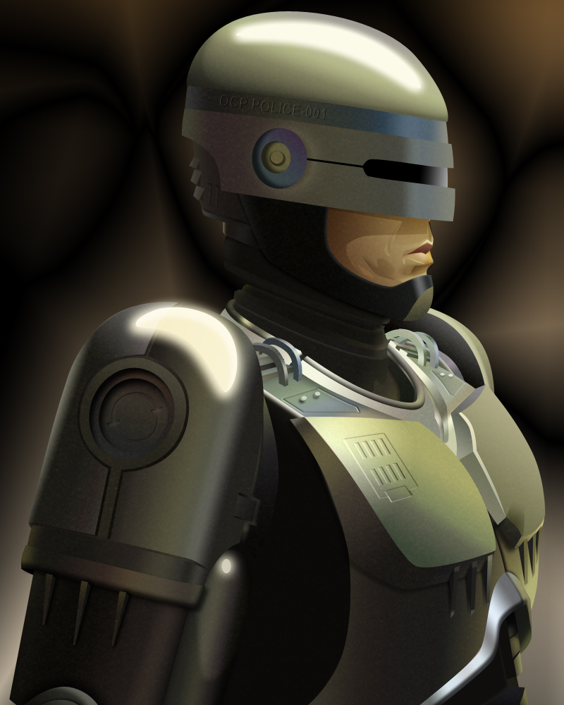
Thanks for the compliments. It did take a lot of experimentation to get things just so, plus with 159 layers to play with, I sometimes found myself a little muddled, but the result I was very happy with... and so was the person who I did it for :D

RoboCop by @Zentron (David Walch)
Was asked to cut out a screen cap from the movie for someone's YT video, but I decided to create an image of the character myself... this is the result!
Category:
Rating:
Everyone
Class:
Finished Work
Submitted:
11y225d ago
Tags:
None
Comments & Critiques (5)
Preferred comment/critique type for this content: Any Kind
Average Rating:
(3)
Average Rating:
(3)
Posted: Monday, 15 April, 2013 @ 02:44 PM
Oh I got lost several times throughout and with each layer having to overlap at certain points, I often found myself having to go an re-arrange the layers so that it all looked seamless!
Knowing the character really well helps for a start, plus I have several sculptures and figures that I can work off, though the lemony colour hue came from the cap.


Holy crap! This is totally awesome! I love the care in the lighting on the metal; it gives it a seriously realistic feel. The precision in your illustration, especially where proportion is concerned, is masterful, as well. Great job!