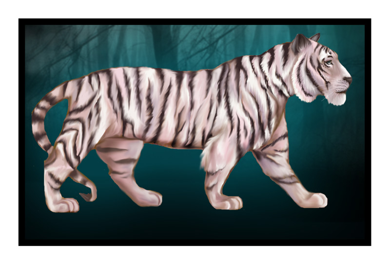
Oh, very nice. I love how you made the markings on her face, especially around her eye. Very beautiful. But i'm most attracted to the background, it's really pretty and I love how you made the trees rather blurry. It makes them look mysterious and without form...I want to go explorin'!

Category:
Rating:
Everyone
Class:
Undefined
Submitted:
19y313d ago
Tags:
None
Comments & Critiques (4)
Preferred comment/critique type for this content: Any Kind
Posted: Monday, 31 January, 2005 @ 10:48 PM
This is very pretty! I like how bold the tiger is against a dark and etheral background. It reminds me slightly of the banner from The Last Samurai. My only complaint is it doesn't look like the tiger has any weight in the picture, he seems to be floating against the background.


AWESOME!! It looks so real, and very cute, excellent anatomy and texture!...Soph